Magnus Hellberg recorded as many wins in November as he did all of the 2013-14 season. (Photo Credit: Scott Paulus)
Starting from this point forward Admirals Roundtable will start giving out an Admiral of the Month Award to the Milwaukee Admirals player who excelled the previous month of play. In November there were two really standout performers that could just as easily share the honors. My selection though: Magnus Hellberg.
During the month of November, Hellberg made seven starts from the Admirals twelve games and won five of them. He had a 1.28 goals against average and a 0.950 save percentage during November and continues to lead the AHL in each of those two categories. With six wins to his name already in 2014-15 – Hellberg has surpassed the amount of wins he secured in net for the Admirals during all of last season – and he equaled that amount in November alone.
The other standout for the Admirals in November is the man I would tab as the Admiral of the Month for October: Brendan Leipsic. In October, he was flying around with his incredible speed and creating tons of offense for himself and his teammates. That same level of play spilled into November and then some. Last month Leipsic recorded 10 points (1 goal, 9 assists) in twelve games. He currently leads the Admirals in scoring and the next closest men in that category… Pontus Åberg, Austin Watson, Viktor Arvidsson, and Anthony Bitetto… are all 5 points behind the rookie from Winnipeg.
~Admiral of the Month Award~
October: Brendan Leipsic
November: Magnus Hellberg
Who do you feel was the Milwaukee Admirals top performer during the month of November? Was it Hellberg, Leipsic, or someone else?
Be sure to follow Admirals Roundtable on Twitter, like us on Facebook, and see our photos on Instagram.
The 2011 NHL Draft was held at the Xcel Energy Center in St. Paul, Minnesota. At the time it wasn’t certain whether or not Magnus Hellberg would be in attendance for the draft or not. He was two-years older than most goaltenders of his draft class and was under the assumption that he would be a late-round pick – at best.
Only four days prior to the day of the draft Hellberg made a phone call to his agent to get him to Minnesota so that he could enjoy the experience of being there. No expectations. No idea which teams could be looking to add him. No clue where he would be selected.
In the 2nd Round, with the 38th Overall Selection, the Nashville Predators made Hellberg the first goaltender that was selected in the 2011 NHL Draft. To think that this moment almost didn’t happen. Only seven years prior he nearly stopped playing the game that he loved.
Hockey season is finally here, Milwaukee. (Photo Credit: Scott Paulus)
Friday night is the start of what should be a fascinating season for the Milwaukee Admirals. Per Elite Prospects, the team will be the youngest in the entire AHL with an average age of 22.75 years old. Thirteen players will be enduring their first full-season of professional hockey in North America. Yet, the story of the season will be whether or not that maturity factor will even matter. This could well be one of the most talented Admirals teams we’ve seen in Milwaukee in a long time.
~The Forgotten Man~
If there was any beneficiary to the Nashville Predators off-season acquisitions it was the Milwaukee Admirals. When the Predators landed James Neal in a trade that sent Patric Hornqvist and Nick Spaling to the Pittsburgh Penguins. When the Predators signed free agents Olli Jokinen, Mike Ribeiro, and Derek Roy. It meant a a log jam effect was in place for centers and wingers on the cusp of cracking the NHL roster.
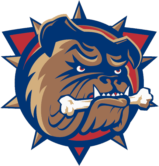
Colton Sissons had an outstanding rookie campaign for the Admirals in 2013-14. He played in 62 games and recorded 44 points (25 goals, 19 assists). Not only that, but he also played 17 games in the NHL where he scored 4 points (1 goal, 3 assists). If there were any one player that lost out the most to the off-season moves the Predators made it was Sissons. The centers mentioned above are ahead of him. As is Calle Jarnkrok. In addition, Mike Fisher and Matt Cullen are each still with the team – both are out with injury – and both will return this season.
So where does this leave the soon to be 21-year old Sissons? Exactly where the Admirals would love to have him. Front and center. It might be a disappointment for him to not have NHL hockey right out of the gate this season but he has the chance to do anything and everything at the AHL level. Something that, as a fourth-line center, he just wouldn’t be afforded to do in Nashville. This could be a season that Sissons looks back on as the one where he learned the most in his career before solidifying himself as an NHL regular. So much of what the Admirals will be in the AHL this season is going to be dependent on having Sissons be a focal point of the team. If he avoids a dreaded sophomore slump it will mean great things, not just for Sissons, but the Milwaukee Admirals 2014-15 season.
~The Other Guys~
Fun Fact. Who lead the Milwaukee Admirals in scoring last season? Miikka Salomaki, 50 points (20 goals, 30 assists) in 75 games. Additional Fun Fact. Salomaki is among eight other returning faces to the forward group. There will be another year in Milwaukee for Mark Van Guilder, Austin Watson, Mike Liambas, Patrick Cehlin, Zach Budish, Josh Shalla, and even Joe Pendenza gets a chance for a full campaign this season. We know plenty of what these guys can do. It’s the other guys that have entered the team this year that gets me all the more excited. Forwards suiting up for their North American professional debuts this season include: Brendan Leipsic, Pontus Åberg, Viktor Arvidsson, Frédérick Gaudreau, and Félix Girard.
Of those names, I feel the one that can have the biggest impact for the Admirals this season is Åberg. He has already played in 100 games as a professional in the Swedish Hockey League. This will be his transition year to North American ice. It appears as though he will be slotted on the team’s top line as a left winger to Sissons at center and Watson on the right wing. He very much reminds me of a Filip Forsberg-Lite. He’s not quite as tall, he’s not quite as flashy, and he’s not quite as talented on offense. What he is, similar to his fellow countryman, is fast. He sees the ice very well and processes things extremely quick. I wouldn’t be surprise me to see Åberg be the top scoring rookie of the Admirals come season’s end. It also wouldn’t surprise me if he led the Admirals in scoring either.
~The Post-Scott Ford Era~
One of the larger talking points heading into this 2014-15 Admirals season is the absence of longtime leader and team captain Scott Ford. When the team was swept by the Toronto Marlies in last season’s playoffs it left plenty of doubt as to his return to the Admirals in 2014-15. He, for the first time in a long time, really looked like a 34-year old defenseman. Add that to a think tank that already includes six new defensemen stepping in for their AHL debuts this season and you are exactly where we are today. A Milwaukee Admirals team without Scott Ford.
Who will be the new leaders of this team? Believe it or not, for the youngest team in the AHL, there are many of names on the roster who have strong leadership qualities.
Jonathan-Ismael Diaby was an alternate captain with the Victoriaville Tigres of the QMJHL. Garrett Noonan was an alternate and then team captain at Boston University. Jimmy Oligny was an alternate captain with two different teams in the QMJHL – most recently with Rimouski Océanic. Jaynen Rissling was an alternate and team captain of the Calgary Hitmen of the WHL. Frédérick Gaudreau was the alternate captain last season for the Drummondville Voltigeurs of the QMJHL. Félix Girard was a team captain the last two-seasons with Baie-Comeau Drakkar of the QMJHL. Joe Pendenza was an alternate captain at UMass-Lowell.
And that’s really just the new guys we’ll add to the deck this season. There are also leaders such as Joe Piskula, Mark Van Guilder, and Triston Grant who will be on the Admirals. Not to mention Sissons – who was a team captain in juniors as well as the Predators recent rookie tournament team. And Watson – who also was a captain at the junior level.
Leadership and the lack of it in the absence of Scott Ford really is a zero issue here. It might be a sentimental issue for some, but the inevitability of time has come for the two to end. Ford is no longer the captain, is no longer an Admiral, and is no longer under contract as a professional hockey player. What he still is though in so many ways is an influence to players within the Nashville and Milwaukee teams through players that have been around him. That influence is still in the Admirals locker room. And, in that sense, the torch has been passed for the next Sheriff to emerge.
~Between The Pipes~
One season ago I was really excited by the prospect of having Magnus Hellberg and Marek Mazanec push one-another to be “the guy” in net for the Admirals. As the story went instead: Pekka Rinne suffered a setback in his recovery process from hip surgery when he had an E. coli infection that made him miss four-months of hockey. Then the goaltending scramble started. Carter Hutton to starter, Hellberg as back-up, Hellberg down, Mazanec up, Scott Darling wins at life, Hellberg gets hurt, Darling gets hurt, trade for Devan Dubnyk, Mazanec down, ditch Devan Dubnyk, Hellberg to Cincinnati, and so ends 2013-14.
Wild, right? How about we try this again in 2014-15 but with a little less brain tearing agony?
What seems to be a boost so far to all involved in the goaltending battle this season is this: no injuries. Even this time last season Hellberg was fighting off an injury he sustained in Nashville camp. Now? Everyone is healthy. Even the man who could prove to be this year’s version of Darling, Rob Madore – who will start his season off in Cincinnati of the ECHL – like Darling did last season – hint, hint, wink.
Should all stay healthy it simply becomes a matter of who is best for the job and wins the majority of playing time in net. I want to say the Admirals are looking at a 1-A and 1-B rather than a 1-2 at the moment but it is still rather early. Should Madore start his season in the ECHL the way he finished it, where he took home the Kelly Cup Finals MVP honors despite being on the losing side of the ECHL Finals, I have to think a move could easily be made to stir the well. Hellberg was on the bench during those exact same Kelly Cup Finals as Madore worked his stuff. The battle for the Admirals net will be hotly contested. It should bring out the best of all three of these goaltenders. Who establishes their authority as the number one choice goaltender? I’m sure that will be a talking point we bash the daylights out of over the course of this season.
~The Green Defense~
In no easier way can you point out the youth of the 2014-15 Admirals than by looking at our defensive core. Regulars that are returning from last season. Anthony Bitetto and Joe Piskula. That’s it. The rest are all fairly fresh names. Some were able to catch the tail end of last season here in Milwaukee but the full slate starts now.
When I think back to last season’s playoff exit I think about a defense that looked stiff, slow, and old. That will be given a swift upgrade this year by the Predators prospects that have moved on from their junior playing career to the AHL: Diaby, Rissling, Vainonen, Noonan, and Oligny. Not to mention there will also be a 22-year old Swede entering the mix with a great weight of professional playing experience already under his belt in Johan Alm.
It could take a little bit of time before we start viewing distinct partnerships formed for defensive pairings. The reasoning for that all comes down to the group at hand. Should Taylor Aronson not make the roster – the Admirals will not have a single right-handed shooting defensemen on the team. Not one. So who slots on what side? Is having a balance or righties and lefties on defense all that important? The Admirals are going to find that question out for themselves by the looks of it. No matter what. This should be a quicker team defense. And that could play out well for the men in net.
The Milwaukee Admirals “Media Day” takes place tomorrow. I will be on hand to interview coaches and players. Expect a follow up on that tomorrow afternoon. The very first “Scouting the Enemy” of this season will appear on Friday morning – followed by opening night gameday coverage on our assorted social media.
Be sure to follow Admirals Roundtable on Twitter, like us on Facebook, and see our photos on Instagram.
Ladies and Gents. The 2014-15 Milwaukee Admirals season is almost here. Fantastic isn’t it? To get you all prepped for this year on Roundtable I would like to give you all the run down of the what and where.
First let’s get the who out of the way. My name is Daniel Lavender and I am the editor-in-chief of Admirals Roundtable. This will be my second season at the helm. If you liked what you got out of our end last year, great news! I fully expect to attend all home games, provide game recaps throughout the entirety of this season, audio from all my practice session or post-game interviews conducted with coaches and players, feature stories, and updates from around the sport of hockey as they occur.
Also contributing to the Roundtable will be Jason Karnosky from time to time. Expect him to provide his news and insight – as well as NHL Trade Deadline Day coverage. To boot, he will again be writing stories that you can read on the main site of the Milwaukee Admirals this season. Keep your eyes peeled when those stories drop.
As always, a roundtable isn’t much of a roundtable without joining in on the discussion. That’s why there are a variety of ways to get into the banter: Twitter, Facebook, Instagram, and right below each and every story on our website in the comments section.
Additionally, you will often find me in the media section at all home games. I also walk the ice after a game and like to chat with you fans by the Admirals player tunnel prior to the start of the head coach’s post-game presser. I’m always happy to hear from you folks in person. Never be shy. Stop on by, say hello, and let’s talk hockey! …it’s kind of my thing.
Our website will really start to get revved up as the Nashville Predators pre-season starts up tomorrow night. As those games rattle off I expect players will start shuffling over to Milwaukee ahead of our own pre-season. The fun is right around the corner. Let’s drop the puck already.
The Milwaukee Admirals IHL logo in use from 1982-1997 is still my all time favorite for any professional team in Milwaukee. Can anyone say throwback night at the BMO Harris Bradley Center?
What makes a great American Hockey League logo? It is history, style, colors, modernization, or none/all of the above? Today I will spell it out by choose the league’s top ten best logos.
The teams it won’t be are from Wednesday’s 30-21 list: Syracuse (30), Iowa (29), Hartford (28), Binghamton (27), Rockford (26), Bridgeport (25), Worcester (24), Albany (23), Texas (22) and Providence (21); and from Thursday’s 20-11 list: Springfield (20), Lehigh Valley (19), Adirondack (18), Hamilton (17), Chicago (16), Charlotte (15), Lake Erie (14), Norfolk (13), Wilkes-Barre/Scranton (12), Manchester (11).
Without further ado, here are the AHL’s best ten logos, starting with number 10, the Utica Comets. Check back later for my five best and worst logos from AHL teams of the past, and analysis of all four Milwaukee Admirals logos, ranked best to worst.
Author’s Note: Separate points are listed for Artistry of the Logo (on a 1-5 scale), Team Name, Color Scheme; and Logo/Team Name History. All logos were gathered from Chris Creamer’s Sportslogos.net.
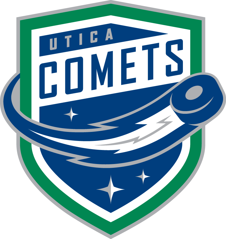
10: Utica Comets: L: 4; N: 5; C: 4; H: 2
Kicking off the top ten best AHL logos is the Utica Comets, coming off their first AHL season. Despite a fairly short history in Utica, the Comets give a fresh look to one of the AHL’s most historic franchises (was formerly the Peoria Rivermen, Springfield Indians and Worcester IceCats to name a few of its stops). The crest itself is extremely sharp and modern, pulling in the green and blue in line with the recent version of their Orca-crested NHL affiliate Vancouver. The streaking hockey puck, with its Comets’ tail also looks cool. Overall, this is a great modern logo addition to the AHL. Bonus points are deserved for a much better look than the old Utica Devils.
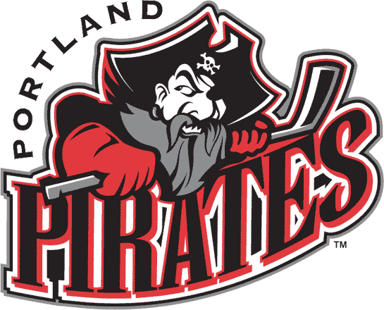
9: Portland Pirates: L: 3; N: 5; C: 4; H: 4
The Portland Pirates were a tough team to place in this ranking, because I actually prefer the franchise’s former logo, which had a rounded head of a Pirate, complete with bandana, facial jewelry and a stick sword in its mouth. This is one of my favorite relics of the 1990s, when Barry Trotz coached one of the AHL’s top teams. The newer version did noticeably modernize the logo, with a tough Pirate holding onto a stick, with one eye looking back. The lettering, though excessive throughout both logos, is sharp and matches the Pirate’s motif and the vivid red and black colors.
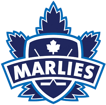
8: Toronto Marlies: L: 4; N: 4; C: 4; H: 4
Over the years Toronto, hockey’s heart, has been home to numerous professional franchises. One of my favorites from the Queen City is the Toronto Marlies, the current affiliate of the Toronto Maple Leafs, which practices in the same facility as its big NHL brother. I actually prefer the Marlies’ Maple Leaf crest and alternate crest to the current NHL version, as these harken back to an dressier older version of Toronto’s NHL team that really stood out. The fact that the team represents a nice homage to the famed former Toronto Marlboros, is an added bonus. Much like the Manchester Monarchs, this is a great way keep the two franchises tied together, but allows each to still stand alone.
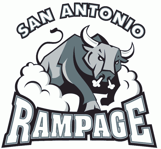
7: San Antonio Rampage: L: 3; N: 4; C: 5; H: 4
Opinions tend to be varied on the logo/jerseys of the San Antonio Rampage. Some, like myself, love the ticked off, stampeding bull, bathed in silver and black (one of hockey’s best color schemes) for a nice match to the ownerships’ San Antonio Spurs of the NBA. Others find it bit too cartoonish. One of my favorite aspects of this logo, is that it represents a full-size bull in motion (note the dust cloud), with not just the head on the crest. Though Florida’s AHL affiliate has rarely had much success on the ice, at least the logo and jersey look stylish.
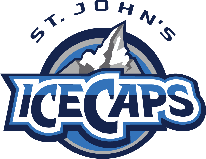
6: St. John’s IceCaps: L: 3; N: 5; C: 5; H: 4
It is easy to be partial toward the St. John’s IceCaps, one of the AHL’s most successfully run franchises located in near-isolation on the island of Newfoundland. The IceCaps, which borrow the primary colors of their NHL affiliate Winnipeg Jets, pull the off the grays and blues better than their parent club, and feature an Iceberg logo much more interesting than the Jets. Much like the moniker Penguins, IceCaps is a terrific hockey nickname and very appropriate for a sport played on a sheet of ice. Meanwhile, the lettering and slightly off center iceberg really standout, providing an effective modernist tone.
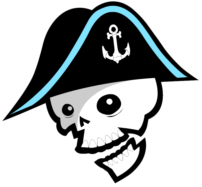
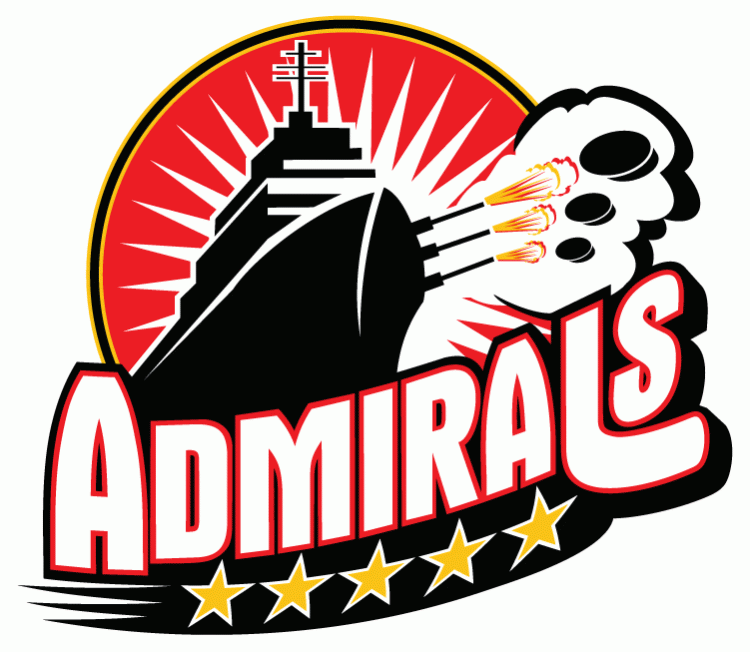
5: Milwaukee Admirals: L: 4; N: 4; C: 4; H: 5
After a somewhat bland prior edition of its logo, the Milwaukee Admirals fired back with a radical new look for the 2006-2007 season. This decision was not without a bit of controversy as the new skeletal look had its share of detractors. However, the biggest issue facing the Admirals is that its alternate logo looks even better than its primary logo does, as it’s hard not to love a skeletal pirate, dressed in full Admiral garb with a peg leg, shooting a puck with his removed boney foot. The regular logo is just the head, but looks artistic with its black and Lake Michigan blue trim hat decorated with an always popular anchor logo. The way both of these logos, which are really without anything comparable in the AHL, look on either a blue or black jersey is really crisp, and are a major contrast to the bright yellow color of Milwaukee’s NHL affiliate, the Nashville Predators.
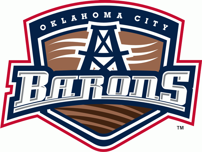
4: Oklahoma City Barons: L: 3; N: 5; C: 5; H: 4
Even though the Oklahoma City Barons’ logo could be considered a bit bland like its NHL affiliate in Edmonton, there are many things that work well for OKC. First off the colors and name are a great homage to the Oilers without being a perfect match, giving each club its own identity. Second the oil derrick and waived line accents really work really well artistically. If I had one criticism it would be the unnecessary use of putting the name Oklahoma City at the top of the crest, but that does help Oklahoma’s oil Barons standout from the former Cleveland Barons.
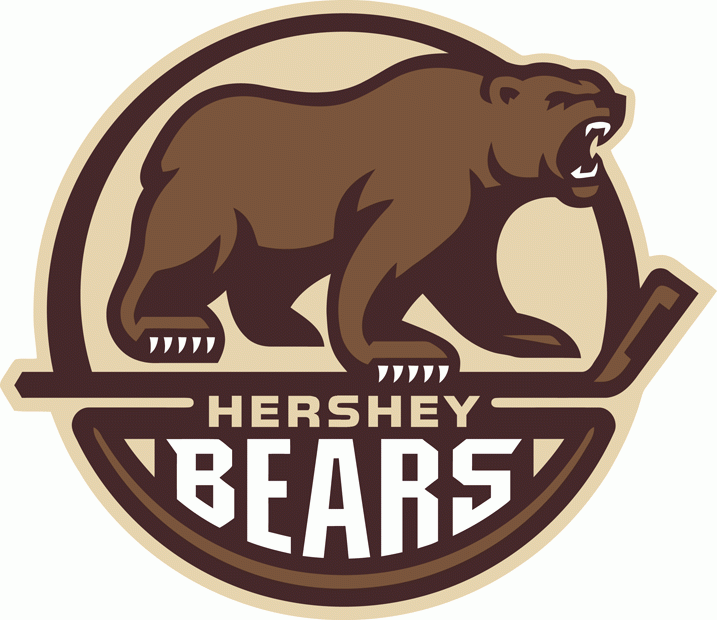
3: Hershey Bears: L: 5; N: 4; C: 5; H: 5
Kicking off the top three best logos is the longest continuously operating member of the American Hockey League, the Hershey Bears. The Bears back up that history with a logo that has evolved over the years, modernizing with the times before settling in for the 2012-2013 campaign with a great throwback-styled log. It is certainly much improved over Hershey’s primary 2000s logo). The wording Hershey Bears is unnecessary here for Washington’s AHL affiliate, because what really steps to the forefront is the mean cocoa brown bear standing on top of a hockey stick. Bonus points are certainly deserved for a team making the city’s signature chocolate color work so effectively in jerseys and logos of its professional hockey franchise. The Providence Bruins could learn a lot from the look of this ferocious Bear.
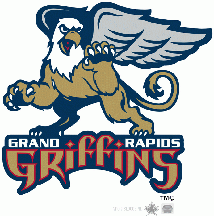
2: Grand Rapids Griffins: L: 5; N: 5; C: 5; H: 4
The team that represents the best modern look in the American Hockey League is the Grand Rapids Griffins. First off, the choice of a Griffin as a mascot is absolutely inspired. This is a great alliterative moniker that is both fearsome and mythical. The nickname lettering itself is medieval cool. Note the selective placement of the city name Grand Rapids and the stylish diamond dotted “I”s in Griffins. Though this team has strong ties to its NHL affiliate in Detroit, it actually started as an independent franchise in the IHL. Despite some of its red and white alternate logos, Grand Rapids has managed to keep its iconic gold, blue, silver and red trim look that dates back to its inception.
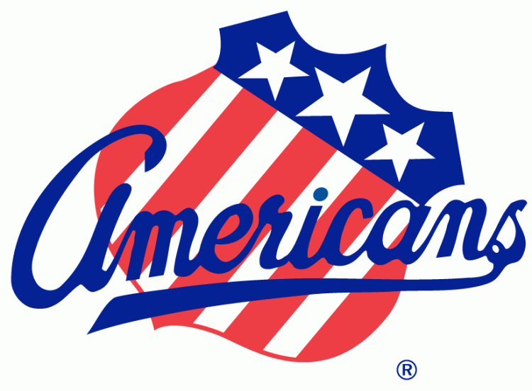
1: Rochester Americans: L: 5; N: 5; C: 5; H: 5
My choice for the American Hockey League’s best logo was an easy one, as the Rochester Americans feature the AHL’s most historic logo and the oldest one that still in use. There is beautiful simplicity with the Rochester’s patriotic red, white and blue shield logo, which features scripted Americans lettering. Originally crafted for the 1972-1973 season, this iconic crest represents just the fourth logo in franchise history, and might stay that way for a while (Rochester’s shield crest itself as the primary logo on jerseys dates back to 1959-1960). If Buffalo’s AHL affiliate would ever decide to modernize a little bit, adding some shadowing would be an easy touch up for this logo. But even as is Rochester stands at the head of the class as having the AHL’s best logo, a far cry from its geographic rival Syracuse, which in my opinion has the league’s worst logo.
So Roundtable . . . What is your pick for the AHL’s Best Logo and/or AHL’s Worst Logo? Where does Milwaukee’s logo fit? Is No. 5 too high, too low, or just right? If you could change the Admirals logo, what would you do?
Prior to a radical change for 2006-2007, Milwaukee utilized this wordy logo from 1997-2006. Did you enjoy this version of the Admirals logo or were you glad to see it go by the wayside?
Today I’m tackling the middle ground of AHL logos, numbers 20 through 11 on a list of the best and worst of team crests. Wednesday saw Syracuse (30), Iowa (29), Hartford (28), Binghamton (27), Rockford (26), Bridgeport (25), Worcester (24), Albany (23), Texas (22) and Providence (21) knocked out of the running for the AHL’s best logo. Without further ado, here are the next ten, starting with number 20, the Springfield Falcons.
Author’s Note: Separate points are listed for Artistry of the Logo (on a 1-5 scale), Team Name, Color Scheme; and Logo/Team Name History. All logos were gathered from Chris Creamer’s Sportslogos.net.
20: Springfield Falcons: L: 3; N: 2: C: 3; H: 2
After the famed Springfield Indians moved to Worcester in 1994, the AHL’s base received another franchise in the Falcons. Due to the trademark, and perhaps other reasons relating to the current Native American issues concerning the former University of North Dakota Fighting Sioux and current Washington Redskins, Springfield adopted the new moniker and a rather dull bird head logo with limiting colors. However, in later years the franchise adopted a much more interesting full bird crest grabbing a stick with its talons, plus a red and blue color scheme. Though the new team lacks the history and tradition of the earlier Indians, this logo keeps getting better with age.
I have always enjoyed the moniker for the Phantoms and how well this logo works with Philadelphia’s black and orange color scheme, even it is a bit on the darker side of team nicknames. Credit to the organization for getting rid of its 1990s lettering, but the big drawback here is simply the location name of Lehigh Valley. I’m not sure why this team can’t just be the Allentown Phantoms, but maybe that might help the new squad draw from a larger vicinity audience.
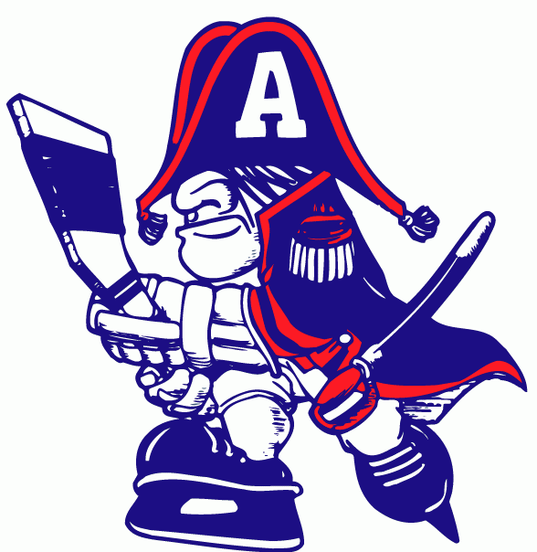
18: Adirondack Flames: L: 3; N: 1; C: 2; H: 2
On lists of the best and worst AHL logos, I’m guessing that this new team’s support would be all over the map. Some like me, love Adirondack’s throwback to the older Atlanta Flames “A” logo, while others might find it a bit too simple and not terribly creative, like Calgary’s “C”, which I always thought looked better during the 1980s. What this logo does represent is the end of the four season run of the AHL’s distant Northwest outpost franchise, the Abbotsford Heat, which despite featuring a great nickname had an extremely plain logo. Bonus points here too for a terrific alternative flaming “A” logo.
17: Hamilton Bulldogs: L: 2; N: 3; C: 3; H: 3
Hamilton was one of the hardest teams to place on this list. The Bulldogs logo itself is a bit on the bland side, though I enjoy the dog collar, sharp teeth, face wrinkles and roughed up bone. The background triangle crest seems a bit unnecessary, and again this logo is just a bulldog head, another drawback. However, the Bulldogs moniker is a great hockey nickname with a lot of history attached to it. Despite this I would rather the team be called the Hamilton Tigers, a throwback to a long-lost member of the NHL that featured extremely sharp yellow and black colors. Considering the fact that Hamilton is Montreal’s AHL affiliate, it is probably better that the AHL’s Bulldogs are not Black and Gold.
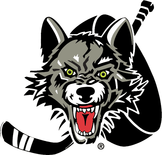
16: Chicago Wolves: L: 2, N: 4; C: 3; H: 3
Originally, the Chicago Wolves ranked much lower on this list due to the simplicity of its creepy wolf head, stick and giant hockey puck logo. But delving deeper, this crest really deserves a better ranking when compared to its peers. The Wolves jerseys, which feature a vivid color scheme, proudly represent one of the AHL’s best modern franchises, born out of Chicago-area hockey fans’ desire to watch affordable professional games (the team posts terrific attendance figures during the frequent labor stoppages of the NHL). I am curious to see what the future holds for Chicago, its logo and its colors, especially if the decision is made to modernize the jersey and/or pull closer to its affiliate the St. Louis Blues, a bitter rival in this part of the country. That certainly didn’t work out too well for Calgary with Abbotsford in nearby Vancouver country.
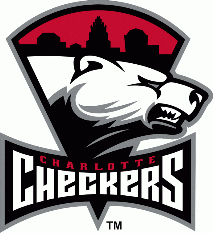
15: Charlotte Checkers: L: 3; N: 4; C: 3; H: 3
The Charlotte Checkers represent another minor league franchise that moved up leagues, this time from the ECHL to the AHL. Interestingly, the Checkers have managed to one-up their NHL affiliate Carolina (which finished last in the Hockey News recent NHL logo rankings) with their sharp logo, fun nickname, and snazzy color scheme. What perhaps most impressive about the Checkers logo is how it emerged from the shadows of some truly awful prior versions dating back to the 1990s. I’m sure Charlotte still has its detractors, but I think this made for a great addition to the AHL back in 2010, and offered a close geographic rival for Norfolk.
14: Lake Erie Monsters: L: 3; N: 4; C: 2; H: 3
Lake Erie is easily one of the most controversial choices on this list, thanks to both its name and logo, but I have a soft spot for the Monsters. First off, the nickname comes from a great historical reference, Bessie, the alleged Lake Erie Monster. Second, the sharp eyes coming out of the water on the logo are quite intimidating. The big issues here are the excessive use of words on the logo (“Cleveland” was recently added, to go along with the original version), and the fact that this franchise replaced one of my IHL/AHL favorites, the Denver/Utah Grizzlies, whose nickname didn’t really fit in Ohio. Historically the Barons represent a lot of hockey history in the Cleveland area, but it was always a franchise that never lasted too long in town. Therefore, the Lake Erie Monsters make sense as a new face of hockey on the Cuyahoga.
13: Norfolk Admirals: L: 2; N: 4; C: 3; H: 4
Though Norfolk represents the AHL’s “other” Admirals for those of us that live in Wisconsin, this area is plenty deserving of also using the nickname considering its impressive naval history. There is also some fun franchise history here, as the Admirals were formerly the Hampton Roads Admirals of the ECHL, before becoming the Norfolk Admirals in the AHL. Norfolk’s logo itself has many pluses and minuses. The positives are its hockey puck cannons, bright colors, battleship and the five stars. The negative is the fact that there is just too much going on throughout this logo, despite all of its interesting elements.
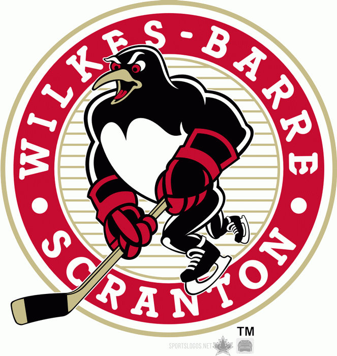
I might get some negative feedback for ranking the Wilkes-Barre/Scranton Penguins, one of America’s favorite minor league franchises and mascots, not in the top 10, but there are some good reasons for its placement here. First, I’m guessing that most Admirals Roundtable followers don’t have to write out the mouthful name Wilkes-Barre/Scranton as frequently as I or any other AHL media member does. Simply put, it’s a pain, a 21-character pain that appears right on the logo’s crest. Second, there isn’t much creativity here since again the Penguins’ name is an exact match of its NHL affiliate in Pittsburgh. However, it’s hard to dislike the sharpness of this version of the Penguins, or its red and black, rather than black and gold, colors, and its mascot Tux. Bonus points are also deserved for some fun alternate logos.
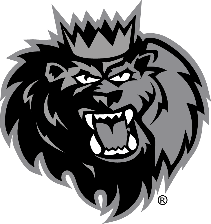
11: Manchester Monarchs: L: 3; N: 4; C: 4; H: 3
The Manchester Monarchs are the perfect example of AHL team borrowing from its NHL affiliate in Los Angeles, but really making it work. First off, they are not the Manchester Kings, but rather the Manchester Monarchs, an alliterative name that means basically the same thing. That alone is brilliant. The second thing that worked here are the colors, as Manchester originally brought in the royal gold and purple long associated with Kings and Queens and its affiliate in Los Angeles. The Monarchs recently changed to Silver and Black to better mesh with the Kings, but it did take away a bit of this franchise’s uniqueness. The lion logo (king of the jungle) is also a perfect choice of mascot, but its drawback is that the crest is just a cartoonish head in place of what could be more. There still are positives in this logo, notably the cool lion mane, teeth, crown and sharp lettering. I just miss the old purple and gold.
Where would you rank the Milwaukee Admirals on a list of the best and worst logos in the American Hockey League?
The Hockey News is currently counting down its rankings of all of the NHL’s logos from worst to best. That concept inspired me to ask the question, what are the best and worst logos in the American Hockey League?
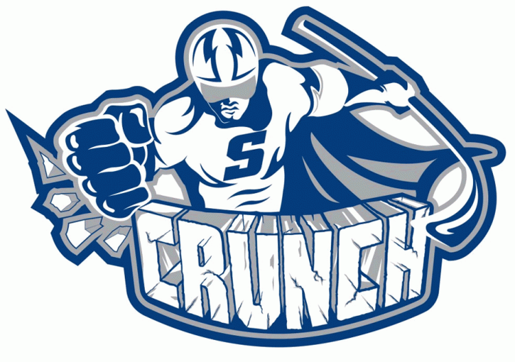
Certainly there are some great AHL jerseys, and some alternative choices that leave little to be desired, but what about just each team’s logos? The AHL has quite the electric mix of team logos and nicknames, from teams that follow strictly the lines of their NHL affiliates, to more cartoonish choices designed to attract family clientele to the rink on any given Saturday night. Some logos are fun, others historic, other hideous. These are my picks for the best and worst logos, starting with the league’s worst, the Syracuse Crunch, and working down to 21.
Check back on Thursday (20-11) and Friday (10-1) for the rest of the AHL.
Author’s Note: Separate points are listed for Artistry of the Logo (on a 1-5 scale), Team Name, Color Scheme; and Logo/Team Name History. All logos were gathered from Chris Creamer’s Sportslogos.net.
30. Syracuse Crunch. L: 1; N: 1; S: 2; H: 1
My pick as the AHL’s weakest team logo is the Syracuse Crunch, for pretty obvious reasons. Amazingly, the current version (unveiled in 2012) is actually better than the two prior versions, 2010 & 1999, which were hypnotic and not in a good way. However, the need for the word Crunch on the logo, plus the cape on “Captain Crunch” leaves little to be desired. Much of the issue here likely stems from the name Crunch, which despite being a nice hockey onomatopoeia makes it difficult to create a snazzy logo.
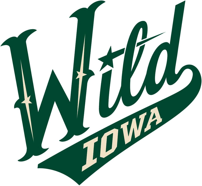
29: Iowa Wild: L: 1; N: 1; S: 3; H: 1
Originality points are certainly lost on the Iowa Wild, which simply borrowed an alternate version of their NHL affiliate Minnesota‘s logo in order to create one of their own. Though Iowa tends to be a rural state, it is not exactly the most “Wild”, so that tends to hurt this choice as well. Finally, the Wild’s logo respresents a unwelcome departure away from the Houston Aeros, which had one of the IHL‘s and AHL‘s best logos along with representing a cool homage to the city’s famed World Hockey Association franchise. Time will tell if the Iowa Wild’s logo will improve in future years and gain something else to distinguish itself from Minnesota, but at the present time this deserves to be near the bottom of this list. The best thing it has going for it? At least it is not the Iowa Chops.
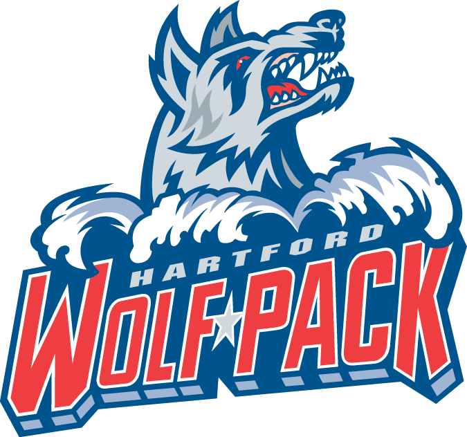
28: Hartford Wolf Pack: L: 2; N: 1; C: 2; H: 1
There is not too much that is terribly unpleasing about the Hartford Wolf Pack fairly bland hockey logo and team name. The issue for me is what this franchise gave up in the process of returning to its original 1997 roots. From 2010-2013 the Wolf Pack became the Connecticut Whale, bringing back one of hockey’s best color schemes and an even better association with the former Hartford Whalers of the NHL, and even earlier the New England Whalers of the WHA. Sadly this was lost again in 2013 when the team transitioned back to a pack of wolves.
27: Binghamton Senators: L: 1; N: 1; C: 3; H: 1
Taking its cues from its NHL parent franchise, the Binghamton Senators’ logo looks similar to Ottawa, if only a bit more cartoonish. The issue here is not the fact that Ottawa doesn’t have a great logo (I think it is middle of the pack for the NHL, Hockey News says 22nd), but why the moniker “Senators” for Binghamton? Simply put there isn’t much originality with this franchise, or with prior AHL teams in the city, but rather a strict association that dates back to Senators inception in New Haven back in 1992-1993.
26: Rockford IceHogs: L: 2; N: 2; C: 3; H: 2
The Rockford IceHogs and their pig biting a stick logo are slowly growing on me as the years pass by. It is a nice homage to the city’s former UHL franchise, while the color scheme fits nicely with its parent Chicago Blackhawks. If I were to make a change here, I would rather the team be called the Rockford Hogs, since I don’t really know what distinguishes an IceHog from a regular pig. The “IceHogs” funky cartoonish lettering is not all that great either.
I happen to be a big fan of the franchise name Bridgeport Sound Tigers (a nice allusion to the Long Island Sound) but this is one of the few redeeming qualities for Bridgeport’s choice of logo. Currently, the logo (which has changed little since its 2001 inception) seems very cartoonish, with just a tiger head and some vibration accents around it. The alternative logos are even worse. With some changes, this could easily move up the list, especially considering the creativity involved in the team name.
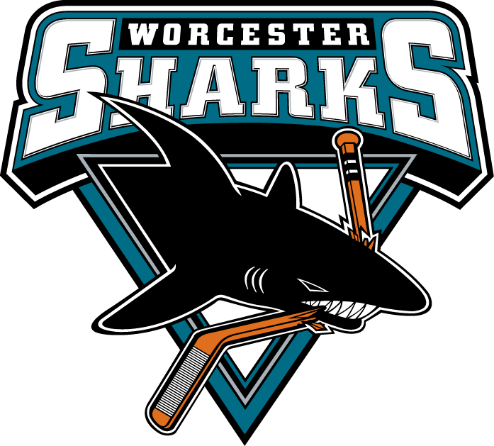
24: Worcester Sharks: L: 2; N: 1; C: 3; H: 1
The next four choices all suffer from their strict associations with their NHL affiliate team names. For the Worcester Sharks, this logo choice really suffers since it is not even an actual coastal city, and I don’t think Sharks are particularly native to Massachusetts Bay, its nearest body of water. What this logo does have going for it is San Jose’s creative base logo and color scheme. I’m not sure why the triangle crest was left in either. Beyond that the Worcester Sharks’ logo just feels very average in the AHL. I kind of miss the old Worcester IceCats, which would be a nice moniker rival for the Rockford IceHogs, but had some of the AHL’s all time worst logos. I also miss the former Shark that played a Baron in Cleveland.
23: Albany Devils: L: 2, N: 2; C: 3; H: 2
Not that there is anything wrong with a full association with a parent NHL franchise, but the creativity tends to suffer for all of the teams that fit in this distinction. For the Albany Devils, the creative “A” Devil logo almost works better than New Jersey’s “NJ” Devils logo (and much, much better than old “U” Utica Devils). Plus I would rather play for a team named the Albany Devils than the former Albany River Rats, which really felt like the minor leagues. However, the top of the “A” almost looks like a halo rather than a pitchfork, bringing up a look too similar to the old California Angels. How ironic.
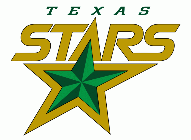
22: Texas Stars: L: 2, N: 3; C: 3; H: 3
The Texas Stars are moving up this list with the help of its parent franchise, which recently ditched much of its inherited look that Dallas brought south from Minnesota with a sharp new green color scheme and lone star crest last season. Texas still retains its old logo, and its name and crest fit very well in its home surroundings of Austin, the capital of the Lone Star State. There isn’t much here that is terribly original (other than the 3D inner star), certainly in comparison to the Texas secondary logo, but it does work well for the Stars.
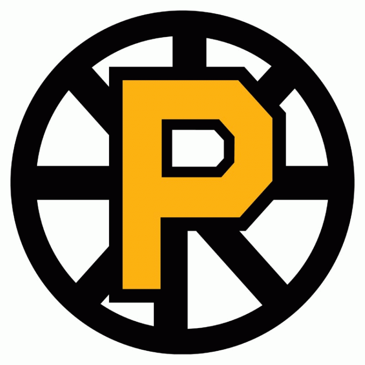
21: Providence Bruins: L: 2; N: 3; C: 4; H: 2
Last on my run of four AHL mimicking franchises is the Providence Bruins, which inherited a logo and color scheme from its NHL affiliate Boston by simply cutting off the bottom right corner of the Bruins’ “Hub” B. The secondary/alternate logos seem to work better for Providence, which would make it stand out a bit more in the AHL. However, I certainly miss a previous version of this franchise, the Maine Mariners, which had a fun, if maybe a bit comical, look. The old Providence Reds also represent one of the league’s great historic franchises.
Awards! Awards Everywhere! (Photo Credit: Scott Paulus)
On Wednesday night, following the first day of the Milwaukee Admirals “Garage Sale” event, myself and a group of fans went to Major Goolsby’s to discuss and create the Admirals Roundtable annual Paper Plate Awards. For those that missed out on that shindig: (1) I would love for us to have some more get-togethers like that and (2) feel free to add your own in the comments!
New to the Roundtable and don’t know the Paper Plate tradition? Check out Ryan Miller’s previous contributions in 2010-11, 2011-12 (Part I and Part II) and 2012-13. Get the gist? Perfect! Now let’s dish out the awards.
1, Hannu Toivonen: The Punniness Man of the Year Award – There wasn’t a player who made a bigger impact in the Milwaukee hockey pun world than Hannu Toivonen this season. After spending the first part of his season with the Toledo Walleye of the ECHL he instantly got Hannu lease on life with the Admirals. It may not have been a long stay for him… but boy did the Twitter puns start getting Hannoying.
2, Anthony Bitteto: The Honorary Sconnie Award – This season Anthony Bitetto slowly but surely developed into a fully blown Sconnie before our eyes. He went to a Green Bay Packers game. His dog, named Reggie, became a Packers fan. He went hunting. He went hunting a lot. Like, a lot. So much so he earned a patch to make it official. Sure, the Admirals take their annual Brewers trip as well but that didn’t stop him from also attending more games. We Sconnies accept you as one of our own, Tony.
3, Jonathan Diaby: The Gregor Clegane “Mountain” Award – He joined at the end of the season but instantly showcased something that set him apart from his new teammates. HE IS CRAZY HUGE. Can you imagine him skating in a defensive pair with Ryan Ellis? No. You can’t.
4, Scott Ford: The Ironman Award – There are plenty of hockey players that battle through injury. The best known Admirals story from this season? Scott Ford returning from a broken foot. He was supposed to be out of action for up to six-weeks. He returned to game action exactly twenty-days following his injury citing his foot felt better in a stiff boot anyways.
5, Teddy Ruth, Michael Young, Jaynen Rissling: The Diabolical Digit Award – This was a bad year for the #5 this season. Sure, Rissling inherited when he joined very late in the season but no other number was used more this season by the Admirals. Ruth retired. Young signed on an ATO, was injured in his first professional game, and was released. Here is hoping the #5 has a better fate in 2014-15.
7, Joe Piskula: The Homestate Hero Award – The Antigo native didn’t just have a great season on the ice. He also had an amazing time off of it. The standout day in mind comes from the Admirals “Antigo Day” which was featured in an episode of All Access. He, as always, was his humble Sconnie self. Oh, and I believe Bitetto would consider him a hunting enabler. Just saying.
8, Filip Forsberg: The Magnifying Glass Award – Ever since his acquisition from the Washington Capitals last season, Filip Forsberg has been under the Nashville microscope BIG time. I completely understand why, as well. He was traded for Michael Latta after all. Truth be told, the kid that drops the teenager title in August still has that little bit more to go yet. I should know. I’ve been telling plenty of Predators fans that all season.
10, Patrick Cehlin: The “I Punched Jon Blum In The Face” Award – This should go without saying… but that was awesome.
11, Paul Crowder: The Longest Neck Award – He played in four-games this season. Just four. Meaning we didn’t really get to witness the amazingness that is Paul Crowder’s neck.
12, Mikko Vainonen: The Next Joonas Jarvinen Award – Finnish? Check. Has a height of 6’3″ tall? Check. Came up through the SM-Liiga? Check. “Stay-at-home” defenseman? Check. Impossible to find photos of him “smiling” on the internet? Yep, they are the same guy.
13, Joe Pendenza: The “Don’t You Forget About Me” Award – He joined the Admirals on an ATO contract after finishing a college playing career for U-Mass-Lowell. After the Ads elimination from this year’s Calder Cup Playoffs he became the second man to re-sign for the 2014-15 season behind Mike Liambas. Joe Pendenza played five-games with the Admirals. Expect him to play more later this year.
15, Kevin Henderson: The Greener Pastures Award – It wasn’t really a trade but it basically worked like one. The Admirals and Texas Stars swapped loan deals between Kevin Henderson and Francis Wathier. While Wathier did well here – Henderson joined the AHL’s best team in the regular season and is in shouting distance of competing in the 2014 Calder Cup Finals.
15, Braden Pimm: The Most Likely To Be Carded Into His Thirties Award – Just look at that face. Now realize this. That face is five-year’s older than this one. …ok, I think both could win this one.
16, Mathieu Tousignant: The Virtual Aspects Closed Captioning Award – When Bitetto asked me if I translate what he says after I interview him, I said I did. It was no joke. Tousi can talk an interesting but amazing form of Frenchified-English faster than the human mind can possibly articulate it – and it is a wonder how anyone could interpret his on ice chirping. (Bonus Points for laughing like the Count)
17, Mike Liambas: The Nostradamus Award – Back in January, while doing a feature story on him, Bus-y accurately predicted his rookie roommate Colton Sissons’ season. AHL All Star and NHL call-up. And he said it on tape. He’s a wise one that Liambas.
18, Colton Sissons: The “Veni, Vidi, Vici” Award – As mentioned above: All Star, NHL call up, first NHL point in his first NHL game (assist), first NHL goal, and was consistently one of the Admirals best all-around players this season. Oh yeah, he was only playing in his first professional playing season at the age of 20-years old. Take a bow if you haven’t already, Colton.
19, Calle Jarnkrok: The Sickest Flow Award – This year’s hot acquisition by the Nashville Predators was able to make an instant impact in the system upon his arrival. No, not the amazing point streak that he had with the Admirals or the Predators. I’m talking about that flow – which was NHL ready from day one.
20, Miikka Salomaki: The “What About Me?” Award – The Nashville Predators called up Taylor Beck, Simon Moser, Colton Sissons, and Mark Van Guilder this season. As for the rookie Finn who finished the season as the Admirals leading scorer? Nope. His name may have always been in the discussion from the start of the season on-forward but Miikka Salomaki never saw the NHL this season. Welp, there is always next year.
21, Simon Moser: The Roundtable’s Olympic Champion Award – Nashville had their share of representatives at the 2014 Winter Olympic Games in Sochi. But so did the Milwaukee Admirals thanks to Simon Moser and Team Switzerland aka Team Moser. He was someone we all cheered for and even had his Olympic moment – scoring a game-winning goal in Switzerland’s opening contest.
22, Scott Valentine: The Facepunching of Bobby Shea Award – If there was an honorary award for the Rockford IceHogs… Bobby Shea would receive the “Biggest Idiot of the Year” Award. Luckily for the Admirals involvement with aforementioned dunderhead extraordinaire – Scott Valentine gave him the punishment many around the game would happily like to have dished up. That was this season’s Liambas vs. McKelvie and I, for one, loved it.
23, Kirill Gotovets: The “How Did I Get Here?” Award – No seriously. He and I still don’t really know how he became an Admiral. Not that it mattered too much because he was eventually let go anyways.
23, Garrett Noonan: The Best Nickname Award – You might be asking yourself just who is Garrett Noonan and what is his nickname? Well my friends, his nickname is Fozzie and we’ll be cheering Fozzie on later this fall.
24, Zach Budish: The Big Head Award – While the debate between Zach Budish and Taylor Beck could go on for years – it was Budish and his teammates who made this name stick. In fact, the full blame may as well go to Budish who gave us the soundbite of the year in Chatterbox.
29, Mark Van Guilder: The Story of the Year Award – I can’t think of a better story that took place this entire season than when 30-year old Mark Van Guilder finally was called up to play NHL hockey. He is as fantastic of a person as you could come across and he earned that call up. Not only did he get his long deserved NHL game. He also provided the NHL Network with their best TV in the history of the network.
31, Marek Mazanec: The Living Emoticon Award – There probably isn’t a player on the team with a better or more frequently displayed smirk on their face. Heck, remember his “almost” goalie fight against Kent Simpson? One of those goalies really wanted to go. Why? the other was laughing and smirking at him the entire time.
33, Bryan Rodney: The Thunderdome Award – There wasn’t a more polarizing player on the Milwaukee Admirals this entire season. Some loved him. Some didn’t. Some nights he would be a liability on defense. Other nights he would serve up perfect passes that triggered goals. Love him. Hate him. He’s the Thunderdome.
36, Joonas Jarvinen: The Least Photogenic Player Award – Just as his clone Mikko Vainonen… he suffers from not–able–to–smile–itis. … he tries, and we love him for that.
41, Taylor Beck: The Most Valuable Player Award – This is one that could very well be debated from a few players but I dare you to defy Taylor Beck’s outstanding 2013-14 season and its impact on the Milwaukee Admirals. He did it all and, frankly, shouldn’t have been with the Admirals for as long as he was.
45, Magnus Hellberg: The Curse of the Goalie Bobblehead Award – When Jeremy Smith was given a bobblehead as an active Admiral player last season he was promptly passed by another goalie and hampered with injury – including a high ankle sprain. This season, Magnus Hellberg was bestowed with a bobblehead of his own as an active playing netminder for the Admirals… only to struggle with injury for the first time in his playing career… including a similar high ankle sprain to that of Smith. Future goalies beware.
47, Francis Wathier: The St. Baldrick’s Foundation’s MVP – Get the reference? How about now? Out of the Admirals players that participated in this year’s “Cuts for a Cause” event none lost more hair than Wathier.
51, Austin Watson: The Mad Hatter Award – There was only one player this entire season who scored a hat trick for the Milwaukee Admirals. It was Austin Watson. And he not only saw hats hit the ice… but about one-thousand more teddy bears the very same night.
55, Charles-Olivier Roussel: The Good Guy Award – It became more and more apparent as the season trucked along that there wasn’t a player who enjoyed giving back to fans more than Mr. Roussel. He is always excited to meet and greet the Admirals fans. He participates in Admirals community outreach programs such as the reading program – where he frequently visited the French immersion school downtown. He even is noted for taking time on the road to acknowledge traveling fans inside and out of the rink. And, if you didn’t know already, is an active friendly voice on social media. Never change, Good Guy Charles.
74, Vinny Saponari: The Most Ginger Player Award – I’m not going to lie. A ten-year old fan at our Goolsby’s Roundtable event came up with this one and it was too perfect.
One of my favorite things from the Roundtable in all honesty are the incredible photos that come up during the course of the season. Especially on the Milwaukee Admirals side of things we have some good people working the lens: Scott Paulus, Jeff Hanisch, and Sara Stathas.
This post is for them, fellow photographers from around the AHL this season, and all you fans. Let’s look back on the 2013-14 Admirals season in pictures!
Chatterbox in progress! Milwaukee Journal Sentinel’s Dave Boehler to the right, Anthony Bitetto teaching us about the mythical land of New York in the center, and some Daniel Lavender bloke to the right. (Photo Credit: Milwaukee Admirals on Instagram)
There have been many great soundbites throughout the Milwaukee Admirals 2013-14 season. If there was a real “thank you” that was lacking in yesterday’s Offseason 101 story it was our amazing coaches and players who’ve all contributed to features here on the Roundtable this season.
Whether it was a great one-liner, an interview bomb, inside joke, or Mike Liambas conducting his very own interview – I have had the tape rolling for plenty of great moments around the Admirals locker room this season. Let’s listen back to the best-of-the-best from the 2013-14 Chatterbox.