
Today I’m tackling the middle ground of AHL logos, numbers 20 through 11 on a list of the best and worst of team crests. Wednesday saw Syracuse (30), Iowa (29), Hartford (28), Binghamton (27), Rockford (26), Bridgeport (25), Worcester (24), Albany (23), Texas (22) and Providence (21) knocked out of the running for the AHL’s best logo. Without further ado, here are the next ten, starting with number 20, the Springfield Falcons.
Author’s Note: Separate points are listed for Artistry of the Logo (on a 1-5 scale), Team Name, Color Scheme; and Logo/Team Name History. All logos were gathered from Chris Creamer’s Sportslogos.net.
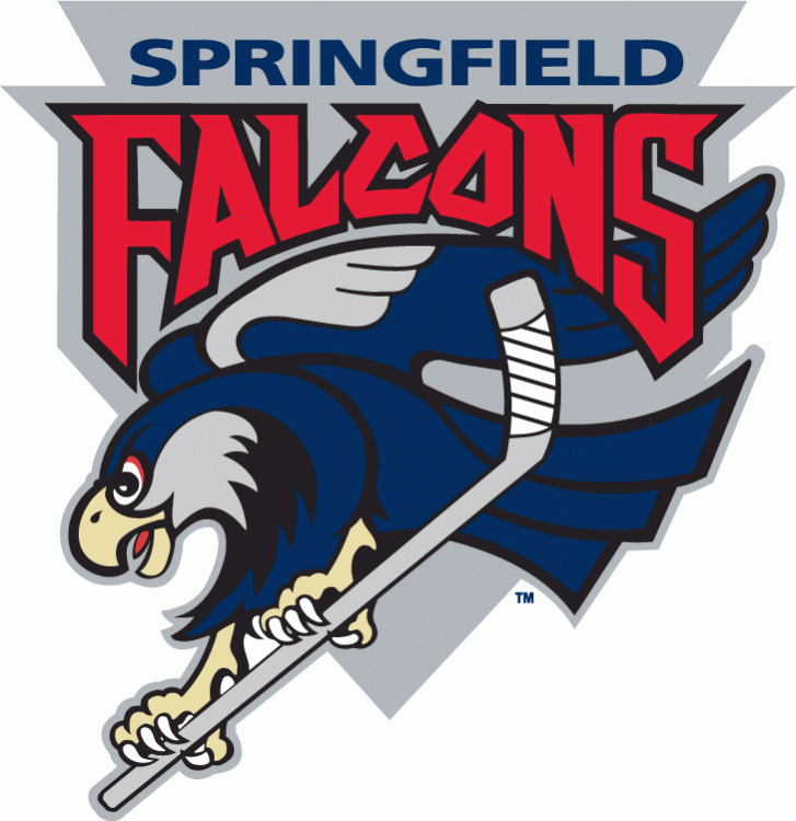
20: Springfield Falcons: L: 3; N: 2: C: 3; H: 2
After the famed Springfield Indians moved to Worcester in 1994, the AHL’s base received another franchise in the Falcons. Due to the trademark, and perhaps other reasons relating to the current Native American issues concerning the former University of North Dakota Fighting Sioux and current Washington Redskins, Springfield adopted the new moniker and a rather dull bird head logo with limiting colors. However, in later years the franchise adopted a much more interesting full bird crest grabbing a stick with its talons, plus a red and blue color scheme. Though the new team lacks the history and tradition of the earlier Indians, this logo keeps getting better with age.
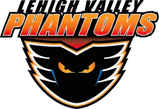
19: Lehigh Valley Phantoms: L: 2; N: 3; C: 3; H: 2
I have always enjoyed the moniker for the Phantoms and how well this logo works with Philadelphia’s black and orange color scheme, even it is a bit on the darker side of team nicknames. Credit to the organization for getting rid of its 1990s lettering, but the big drawback here is simply the location name of Lehigh Valley. I’m not sure why this team can’t just be the Allentown Phantoms, but maybe that might help the new squad draw from a larger vicinity audience.
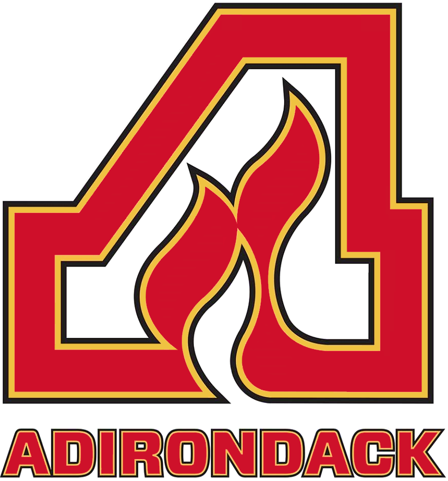
18: Adirondack Flames: L: 3; N: 1; C: 2; H: 2
On lists of the best and worst AHL logos, I’m guessing that this new team’s support would be all over the map. Some like me, love Adirondack’s throwback to the older Atlanta Flames “A” logo, while others might find it a bit too simple and not terribly creative, like Calgary’s “C”, which I always thought looked better during the 1980s. What this logo does represent is the end of the four season run of the AHL’s distant Northwest outpost franchise, the Abbotsford Heat, which despite featuring a great nickname had an extremely plain logo. Bonus points here too for a terrific alternative flaming “A” logo.
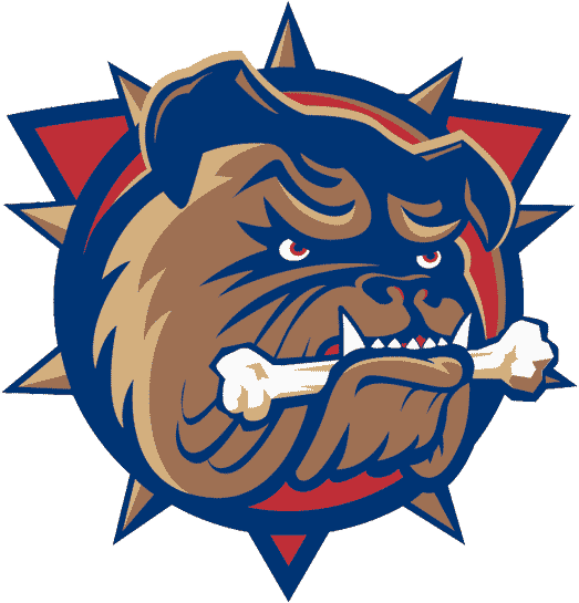
17: Hamilton Bulldogs: L: 2; N: 3; C: 3; H: 3
Hamilton was one of the hardest teams to place on this list. The Bulldogs logo itself is a bit on the bland side, though I enjoy the dog collar, sharp teeth, face wrinkles and roughed up bone. The background triangle crest seems a bit unnecessary, and again this logo is just a bulldog head, another drawback. However, the Bulldogs moniker is a great hockey nickname with a lot of history attached to it. Despite this I would rather the team be called the Hamilton Tigers, a throwback to a long-lost member of the NHL that featured extremely sharp yellow and black colors. Considering the fact that Hamilton is Montreal’s AHL affiliate, it is probably better that the AHL’s Bulldogs are not Black and Gold.
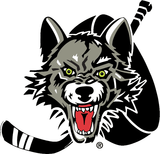
16: Chicago Wolves: L: 2, N: 4; C: 3; H: 3
Originally, the Chicago Wolves ranked much lower on this list due to the simplicity of its creepy wolf head, stick and giant hockey puck logo. But delving deeper, this crest really deserves a better ranking when compared to its peers. The Wolves jerseys, which feature a vivid color scheme, proudly represent one of the AHL’s best modern franchises, born out of Chicago-area hockey fans’ desire to watch affordable professional games (the team posts terrific attendance figures during the frequent labor stoppages of the NHL). I am curious to see what the future holds for Chicago, its logo and its colors, especially if the decision is made to modernize the jersey and/or pull closer to its affiliate the St. Louis Blues, a bitter rival in this part of the country. That certainly didn’t work out too well for Calgary with Abbotsford in nearby Vancouver country.
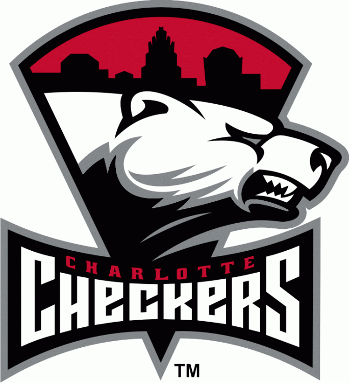
15: Charlotte Checkers: L: 3; N: 4; C: 3; H: 3
The Charlotte Checkers represent another minor league franchise that moved up leagues, this time from the ECHL to the AHL. Interestingly, the Checkers have managed to one-up their NHL affiliate Carolina (which finished last in the Hockey News recent NHL logo rankings) with their sharp logo, fun nickname, and snazzy color scheme. What perhaps most impressive about the Checkers logo is how it emerged from the shadows of some truly awful prior versions dating back to the 1990s. I’m sure Charlotte still has its detractors, but I think this made for a great addition to the AHL back in 2010, and offered a close geographic rival for Norfolk.

14: Lake Erie Monsters: L: 3; N: 4; C: 2; H: 3
Lake Erie is easily one of the most controversial choices on this list, thanks to both its name and logo, but I have a soft spot for the Monsters. First off, the nickname comes from a great historical reference, Bessie, the alleged Lake Erie Monster. Second, the sharp eyes coming out of the water on the logo are quite intimidating. The big issues here are the excessive use of words on the logo (“Cleveland” was recently added, to go along with the original version), and the fact that this franchise replaced one of my IHL/AHL favorites, the Denver/Utah Grizzlies, whose nickname didn’t really fit in Ohio. Historically the Barons represent a lot of hockey history in the Cleveland area, but it was always a franchise that never lasted too long in town. Therefore, the Lake Erie Monsters make sense as a new face of hockey on the Cuyahoga.
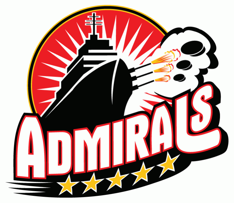
13: Norfolk Admirals: L: 2; N: 4; C: 3; H: 4
Though Norfolk represents the AHL’s “other” Admirals for those of us that live in Wisconsin, this area is plenty deserving of also using the nickname considering its impressive naval history. There is also some fun franchise history here, as the Admirals were formerly the Hampton Roads Admirals of the ECHL, before becoming the Norfolk Admirals in the AHL. Norfolk’s logo itself has many pluses and minuses. The positives are its hockey puck cannons, bright colors, battleship and the five stars. The negative is the fact that there is just too much going on throughout this logo, despite all of its interesting elements.
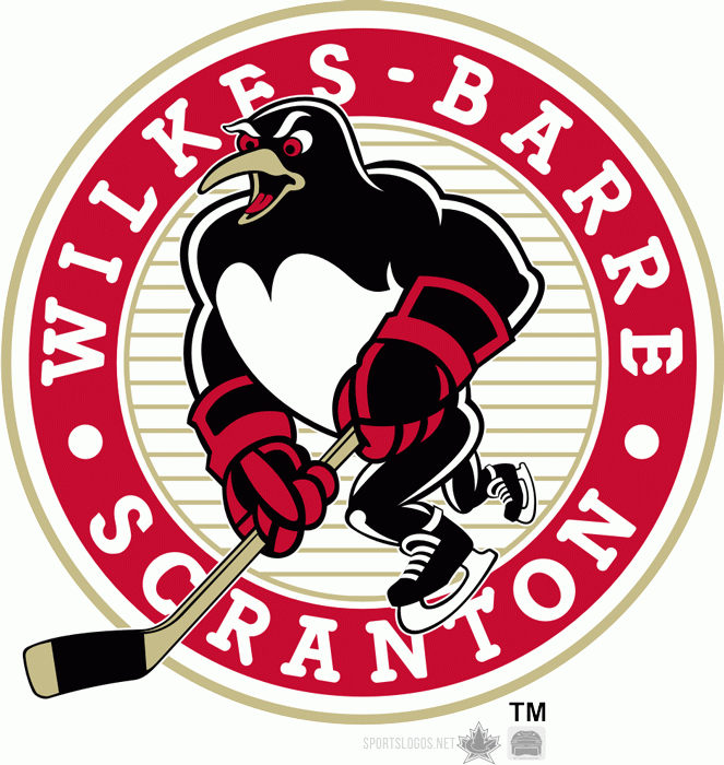
12: Wilkes-Barre/Scranton Penguins: L: 4; N: 2; C: 4; H: 2
I might get some negative feedback for ranking the Wilkes-Barre/Scranton Penguins, one of America’s favorite minor league franchises and mascots, not in the top 10, but there are some good reasons for its placement here. First, I’m guessing that most Admirals Roundtable followers don’t have to write out the mouthful name Wilkes-Barre/Scranton as frequently as I or any other AHL media member does. Simply put, it’s a pain, a 21-character pain that appears right on the logo’s crest. Second, there isn’t much creativity here since again the Penguins’ name is an exact match of its NHL affiliate in Pittsburgh. However, it’s hard to dislike the sharpness of this version of the Penguins, or its red and black, rather than black and gold, colors, and its mascot Tux. Bonus points are also deserved for some fun alternate logos.
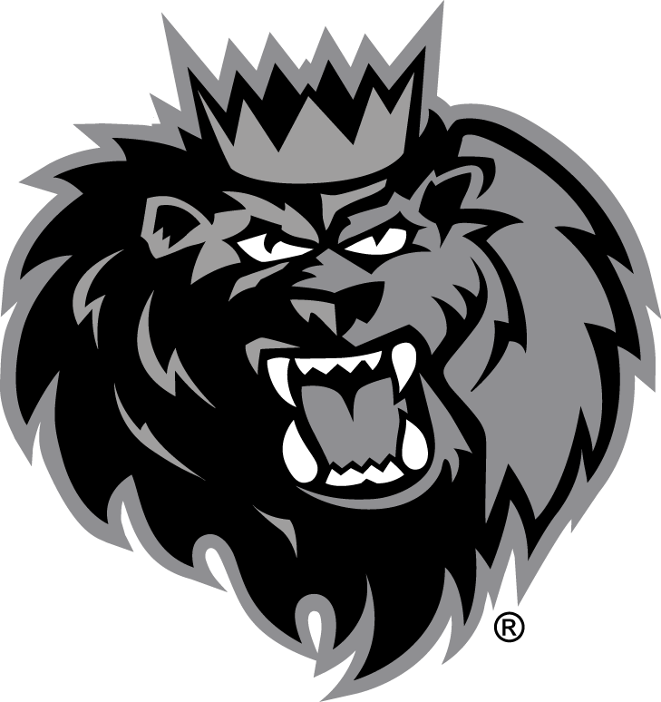
11: Manchester Monarchs: L: 3; N: 4; C: 4; H: 3
The Manchester Monarchs are the perfect example of AHL team borrowing from its NHL affiliate in Los Angeles, but really making it work. First off, they are not the Manchester Kings, but rather the Manchester Monarchs, an alliterative name that means basically the same thing. That alone is brilliant. The second thing that worked here are the colors, as Manchester originally brought in the royal gold and purple long associated with Kings and Queens and its affiliate in Los Angeles. The Monarchs recently changed to Silver and Black to better mesh with the Kings, but it did take away a bit of this franchise’s uniqueness. The lion logo (king of the jungle) is also a perfect choice of mascot, but its drawback is that the crest is just a cartoonish head in place of what could be more. There still are positives in this logo, notably the cool lion mane, teeth, crown and sharp lettering. I just miss the old purple and gold.
The AHL’s Best and Worst Logos, Teams 30-21 … Teams 10-1.

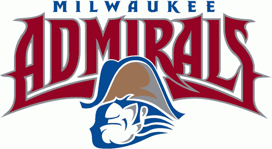
I would rank the LE Monsters logo higher. I think it’s creative and I like the color scheme. As for comparing anything to the Milwaukee Admirals logo, it’s hard to be objective. I do honestly think it’s one of the more fun/creative logos in the AHL, but I could never be objective enough to say whether it should be top 3 or not. I’m sure there are many that would say it’s too cartoonish and what does Admirals have to do with Milwaukee?
Besides the current one, I like the old logo from the 70s, and especially when they had the throwback jerseys with that and the fleur-de-lis on them. Those were really cool. The logo after that with the skating admiral was cool too, but the one just prior to the present was pretty boring.
The LEM logo is easily one of the most creative in the AHL, and that is one of things I really like about it. That carries it into the top half of the league. Beyond that I did spell out some issues, which keeps it only at #14 on my list. I’m sure many others would rank it much lower than I did.
I like LEMs logo always have very slick and keeps you wondering what the whole monster looks like. The Wolves, I’m sorry it’s kinda old and clunky the whole thing looks like a cat getting run over by a tire with a hockey stick the logo needs some TLC and perhaps a complete makeover. I loved Springfields old jerseys with the talons on the sleeves so cool! I may be they only one that thinks itd be fun for the ads to do a special jersey thats all black with the anchor logo and white ripped or edgy numbers on back. Just a thought