
What makes a great American Hockey League logo? It is history, style, colors, modernization, or none/all of the above? Today I will spell it out by choose the league’s top ten best logos.
The teams it won’t be are from Wednesday’s 30-21 list: Syracuse (30), Iowa (29), Hartford (28), Binghamton (27), Rockford (26), Bridgeport (25), Worcester (24), Albany (23), Texas (22) and Providence (21); and from Thursday’s 20-11 list: Springfield (20), Lehigh Valley (19), Adirondack (18), Hamilton (17), Chicago (16), Charlotte (15), Lake Erie (14), Norfolk (13), Wilkes-Barre/Scranton (12), Manchester (11).
Without further ado, here are the AHL’s best ten logos, starting with number 10, the Utica Comets. Check back later for my five best and worst logos from AHL teams of the past, and analysis of all four Milwaukee Admirals logos, ranked best to worst.
Author’s Note: Separate points are listed for Artistry of the Logo (on a 1-5 scale), Team Name, Color Scheme; and Logo/Team Name History. All logos were gathered from Chris Creamer’s Sportslogos.net.
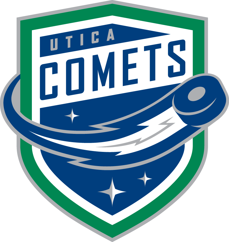
10: Utica Comets: L: 4; N: 5; C: 4; H: 2
Kicking off the top ten best AHL logos is the Utica Comets, coming off their first AHL season. Despite a fairly short history in Utica, the Comets give a fresh look to one of the AHL’s most historic franchises (was formerly the Peoria Rivermen, Springfield Indians and Worcester IceCats to name a few of its stops). The crest itself is extremely sharp and modern, pulling in the green and blue in line with the recent version of their Orca-crested NHL affiliate Vancouver. The streaking hockey puck, with its Comets’ tail also looks cool. Overall, this is a great modern logo addition to the AHL. Bonus points are deserved for a much better look than the old Utica Devils.
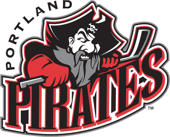
9: Portland Pirates: L: 3; N: 5; C: 4; H: 4
The Portland Pirates were a tough team to place in this ranking, because I actually prefer the franchise’s former logo, which had a rounded head of a Pirate, complete with bandana, facial jewelry and a stick sword in its mouth. This is one of my favorite relics of the 1990s, when Barry Trotz coached one of the AHL’s top teams. The newer version did noticeably modernize the logo, with a tough Pirate holding onto a stick, with one eye looking back. The lettering, though excessive throughout both logos, is sharp and matches the Pirate’s motif and the vivid red and black colors.
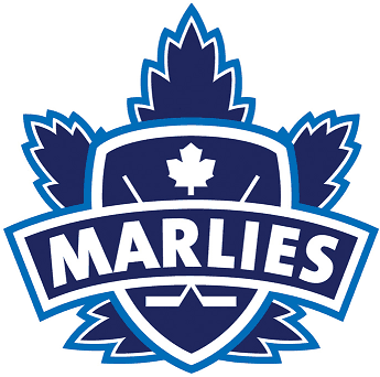
8: Toronto Marlies: L: 4; N: 4; C: 4; H: 4
Over the years Toronto, hockey’s heart, has been home to numerous professional franchises. One of my favorites from the Queen City is the Toronto Marlies, the current affiliate of the Toronto Maple Leafs, which practices in the same facility as its big NHL brother. I actually prefer the Marlies’ Maple Leaf crest and alternate crest to the current NHL version, as these harken back to an dressier older version of Toronto’s NHL team that really stood out. The fact that the team represents a nice homage to the famed former Toronto Marlboros, is an added bonus. Much like the Manchester Monarchs, this is a great way keep the two franchises tied together, but allows each to still stand alone.
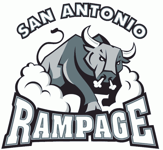
7: San Antonio Rampage: L: 3; N: 4; C: 5; H: 4
Opinions tend to be varied on the logo/jerseys of the San Antonio Rampage. Some, like myself, love the ticked off, stampeding bull, bathed in silver and black (one of hockey’s best color schemes) for a nice match to the ownerships’ San Antonio Spurs of the NBA. Others find it bit too cartoonish. One of my favorite aspects of this logo, is that it represents a full-size bull in motion (note the dust cloud), with not just the head on the crest. Though Florida’s AHL affiliate has rarely had much success on the ice, at least the logo and jersey look stylish.
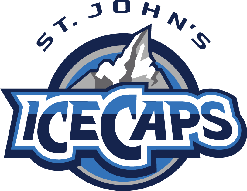
6: St. John’s IceCaps: L: 3; N: 5; C: 5; H: 4
It is easy to be partial toward the St. John’s IceCaps, one of the AHL’s most successfully run franchises located in near-isolation on the island of Newfoundland. The IceCaps, which borrow the primary colors of their NHL affiliate Winnipeg Jets, pull the off the grays and blues better than their parent club, and feature an Iceberg logo much more interesting than the Jets. Much like the moniker Penguins, IceCaps is a terrific hockey nickname and very appropriate for a sport played on a sheet of ice. Meanwhile, the lettering and slightly off center iceberg really standout, providing an effective modernist tone.

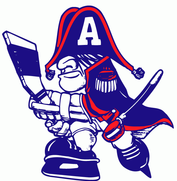
5: Milwaukee Admirals: L: 4; N: 4; C: 4; H: 5
After a somewhat bland prior edition of its logo, the Milwaukee Admirals fired back with a radical new look for the 2006-2007 season. This decision was not without a bit of controversy as the new skeletal look had its share of detractors. However, the biggest issue facing the Admirals is that its alternate logo looks even better than its primary logo does, as it’s hard not to love a skeletal pirate, dressed in full Admiral garb with a peg leg, shooting a puck with his removed boney foot. The regular logo is just the head, but looks artistic with its black and Lake Michigan blue trim hat decorated with an always popular anchor logo. The way both of these logos, which are really without anything comparable in the AHL, look on either a blue or black jersey is really crisp, and are a major contrast to the bright yellow color of Milwaukee’s NHL affiliate, the Nashville Predators.
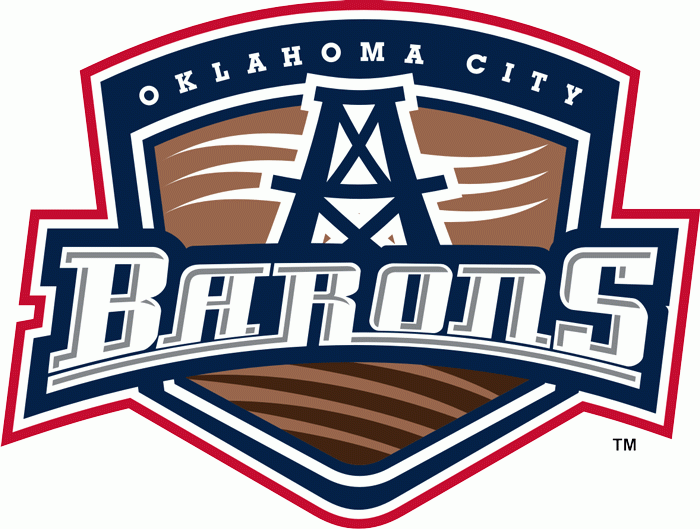
4: Oklahoma City Barons: L: 3; N: 5; C: 5; H: 4
Even though the Oklahoma City Barons’ logo could be considered a bit bland like its NHL affiliate in Edmonton, there are many things that work well for OKC. First off the colors and name are a great homage to the Oilers without being a perfect match, giving each club its own identity. Second the oil derrick and waived line accents really work really well artistically. If I had one criticism it would be the unnecessary use of putting the name Oklahoma City at the top of the crest, but that does help Oklahoma’s oil Barons standout from the former Cleveland Barons.
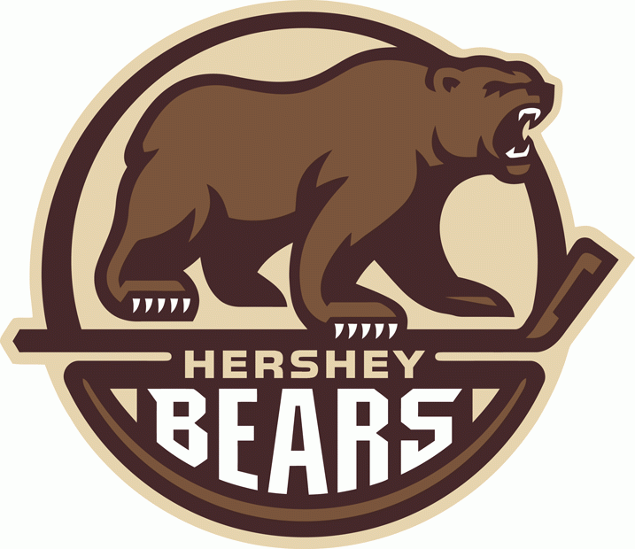
3: Hershey Bears: L: 5; N: 4; C: 5; H: 5
Kicking off the top three best logos is the longest continuously operating member of the American Hockey League, the Hershey Bears. The Bears back up that history with a logo that has evolved over the years, modernizing with the times before settling in for the 2012-2013 campaign with a great throwback-styled log. It is certainly much improved over Hershey’s primary 2000s logo). The wording Hershey Bears is unnecessary here for Washington’s AHL affiliate, because what really steps to the forefront is the mean cocoa brown bear standing on top of a hockey stick. Bonus points are certainly deserved for a team making the city’s signature chocolate color work so effectively in jerseys and logos of its professional hockey franchise. The Providence Bruins could learn a lot from the look of this ferocious Bear.
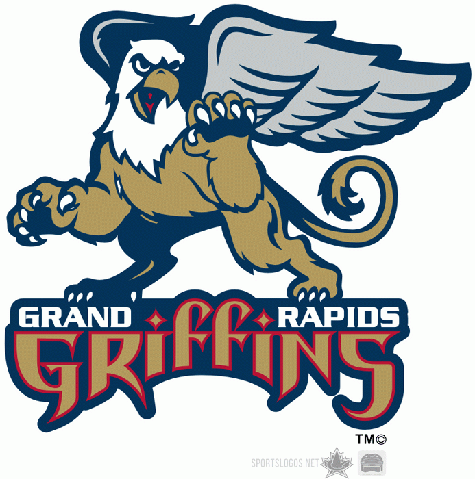
2: Grand Rapids Griffins: L: 5; N: 5; C: 5; H: 4
The team that represents the best modern look in the American Hockey League is the Grand Rapids Griffins. First off, the choice of a Griffin as a mascot is absolutely inspired. This is a great alliterative moniker that is both fearsome and mythical. The nickname lettering itself is medieval cool. Note the selective placement of the city name Grand Rapids and the stylish diamond dotted “I”s in Griffins. Though this team has strong ties to its NHL affiliate in Detroit, it actually started as an independent franchise in the IHL. Despite some of its red and white alternate logos, Grand Rapids has managed to keep its iconic gold, blue, silver and red trim look that dates back to its inception.
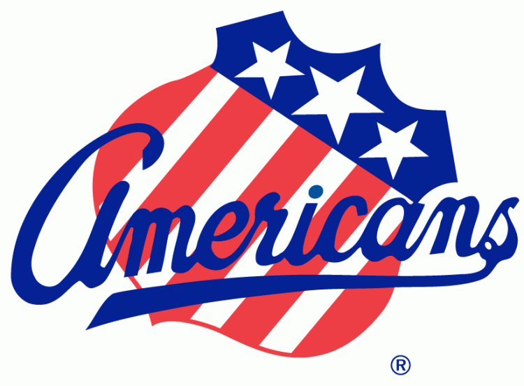
1: Rochester Americans: L: 5; N: 5; C: 5; H: 5
My choice for the American Hockey League’s best logo was an easy one, as the Rochester Americans feature the AHL’s most historic logo and the oldest one that still in use. There is beautiful simplicity with the Rochester’s patriotic red, white and blue shield logo, which features scripted Americans lettering. Originally crafted for the 1972-1973 season, this iconic crest represents just the fourth logo in franchise history, and might stay that way for a while (Rochester’s shield crest itself as the primary logo on jerseys dates back to 1959-1960). If Buffalo’s AHL affiliate would ever decide to modernize a little bit, adding some shadowing would be an easy touch up for this logo. But even as is Rochester stands at the head of the class as having the AHL’s best logo, a far cry from its geographic rival Syracuse, which in my opinion has the league’s worst logo.
So Roundtable . . . What is your pick for the AHL’s Best Logo and/or AHL’s Worst Logo? Where does Milwaukee’s logo fit? Is No. 5 too high, too low, or just right? If you could change the Admirals logo, what would you do?
The AHL’s Best and Worst Logos, Teams 30-21 … Teams 20-11.

You are right about the Amerks’ logo being the AHL’s top design. But a form of the current logo from 1972-73 actually was the official team logo from 1956. The ’56 version had the script team name in White with a Black outline. And the shield crest had Black shading on its right side to give it a “raised” effect. This crest did not appear on the initial uniforms. In 1959-60 just the raised shield emblem appeared on the sweaters. I used to work for the Amerks’ uniform supplier.
You can see the history of the Amerks’ uniforms by going to the Amerks Booster Club web site at http://www.amerksboosterclub.com and click onto the “Photos-Archives” prompt on the lefts side of the page. Then click onto my uniform history section. There are photos of Amerk uniforms fro the beginning and also check out the historical photos of the Amerks’ AHL opponents. I think you’ll enjoy the site.
Terry,
Thanks for reading the list and offering some terrific historical insights into the Americans’ logo history. To see Rochester’s (via Terry Proctor) uniform history, click here: http://www.amerksboosterclub.com/amerksuniforms.html. Though I list the current Amerks’ logo as the AHL’s best, my favorite is still the 1960s version, without the scripted “Americans”. I almost wish the 1960s USA Olympic Hockey Team used those jerseys rather than their iconic gold-medal winning look: http://olympics.usahockey.com/page/show/1093468-1960-olympic-winter-games.
Havfing read this I thought it was rather informative.
I apreciate yoou taking the time and effort to putt
this short artiicle together. I once again ffind myself personally spending a lot
of time both reading and leaving comments. But so what, it was still worth it!