
The Hockey News is currently counting down its rankings of all of the NHL’s logos from worst to best. That concept inspired me to ask the question, what are the best and worst logos in the American Hockey League?
Certainly there are some great AHL jerseys, and some alternative choices that leave little to be desired, but what about just each team’s logos? The AHL has quite the electric mix of team logos and nicknames, from teams that follow strictly the lines of their NHL affiliates, to more cartoonish choices designed to attract family clientele to the rink on any given Saturday night. Some logos are fun, others historic, other hideous. These are my picks for the best and worst logos, starting with the league’s worst, the Syracuse Crunch, and working down to 21.
Check back on Thursday (20-11) and Friday (10-1) for the rest of the AHL.
Author’s Note: Separate points are listed for Artistry of the Logo (on a 1-5 scale), Team Name, Color Scheme; and Logo/Team Name History. All logos were gathered from Chris Creamer’s Sportslogos.net.
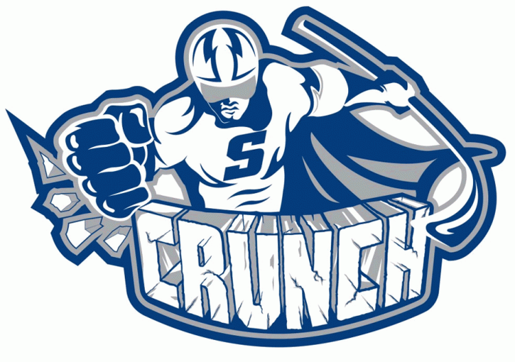
30. Syracuse Crunch. L: 1; N: 1; S: 2; H: 1
My pick as the AHL’s weakest team logo is the Syracuse Crunch, for pretty obvious reasons. Amazingly, the current version (unveiled in 2012) is actually better than the two prior versions, 2010 & 1999, which were hypnotic and not in a good way. However, the need for the word Crunch on the logo, plus the cape on “Captain Crunch” leaves little to be desired. Much of the issue here likely stems from the name Crunch, which despite being a nice hockey onomatopoeia makes it difficult to create a snazzy logo.
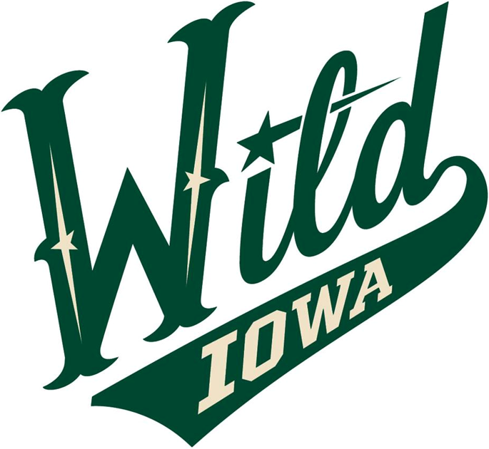
29: Iowa Wild: L: 1; N: 1; S: 3; H: 1
Originality points are certainly lost on the Iowa Wild, which simply borrowed an alternate version of their NHL affiliate Minnesota‘s logo in order to create one of their own. Though Iowa tends to be a rural state, it is not exactly the most “Wild”, so that tends to hurt this choice as well. Finally, the Wild’s logo respresents a unwelcome departure away from the Houston Aeros, which had one of the IHL‘s and AHL‘s best logos along with representing a cool homage to the city’s famed World Hockey Association franchise. Time will tell if the Iowa Wild’s logo will improve in future years and gain something else to distinguish itself from Minnesota, but at the present time this deserves to be near the bottom of this list. The best thing it has going for it? At least it is not the Iowa Chops.
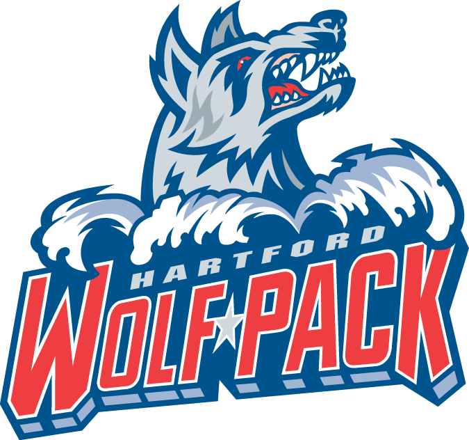
28: Hartford Wolf Pack: L: 2; N: 1; C: 2; H: 1
There is not too much that is terribly unpleasing about the Hartford Wolf Pack fairly bland hockey logo and team name. The issue for me is what this franchise gave up in the process of returning to its original 1997 roots. From 2010-2013 the Wolf Pack became the Connecticut Whale, bringing back one of hockey’s best color schemes and an even better association with the former Hartford Whalers of the NHL, and even earlier the New England Whalers of the WHA. Sadly this was lost again in 2013 when the team transitioned back to a pack of wolves.

27: Binghamton Senators: L: 1; N: 1; C: 3; H: 1
Taking its cues from its NHL parent franchise, the Binghamton Senators’ logo looks similar to Ottawa, if only a bit more cartoonish. The issue here is not the fact that Ottawa doesn’t have a great logo (I think it is middle of the pack for the NHL, Hockey News says 22nd), but why the moniker “Senators” for Binghamton? Simply put there isn’t much originality with this franchise, or with prior AHL teams in the city, but rather a strict association that dates back to Senators inception in New Haven back in 1992-1993.

26: Rockford IceHogs: L: 2; N: 2; C: 3; H: 2
The Rockford IceHogs and their pig biting a stick logo are slowly growing on me as the years pass by. It is a nice homage to the city’s former UHL franchise, while the color scheme fits nicely with its parent Chicago Blackhawks. If I were to make a change here, I would rather the team be called the Rockford Hogs, since I don’t really know what distinguishes an IceHog from a regular pig. The “IceHogs” funky cartoonish lettering is not all that great either.

25: Bridgeport Sound Tigers: L: 1; N: 4; C: 2; H: 2
I happen to be a big fan of the franchise name Bridgeport Sound Tigers (a nice allusion to the Long Island Sound) but this is one of the few redeeming qualities for Bridgeport’s choice of logo. Currently, the logo (which has changed little since its 2001 inception) seems very cartoonish, with just a tiger head and some vibration accents around it. The alternative logos are even worse. With some changes, this could easily move up the list, especially considering the creativity involved in the team name.
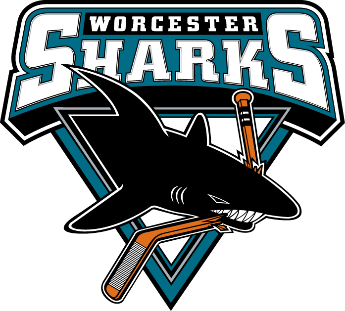
24: Worcester Sharks: L: 2; N: 1; C: 3; H: 1
The next four choices all suffer from their strict associations with their NHL affiliate team names. For the Worcester Sharks, this logo choice really suffers since it is not even an actual coastal city, and I don’t think Sharks are particularly native to Massachusetts Bay, its nearest body of water. What this logo does have going for it is San Jose’s creative base logo and color scheme. I’m not sure why the triangle crest was left in either. Beyond that the Worcester Sharks’ logo just feels very average in the AHL. I kind of miss the old Worcester IceCats, which would be a nice moniker rival for the Rockford IceHogs, but had some of the AHL’s all time worst logos. I also miss the former Shark that played a Baron in Cleveland.

23: Albany Devils: L: 2, N: 2; C: 3; H: 2
Not that there is anything wrong with a full association with a parent NHL franchise, but the creativity tends to suffer for all of the teams that fit in this distinction. For the Albany Devils, the creative “A” Devil logo almost works better than New Jersey’s “NJ” Devils logo (and much, much better than old “U” Utica Devils). Plus I would rather play for a team named the Albany Devils than the former Albany River Rats, which really felt like the minor leagues. However, the top of the “A” almost looks like a halo rather than a pitchfork, bringing up a look too similar to the old California Angels. How ironic.
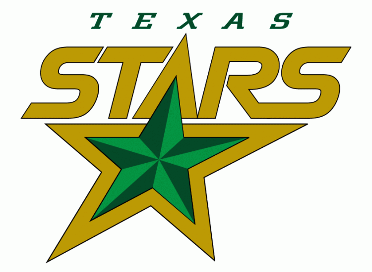
22: Texas Stars: L: 2, N: 3; C: 3; H: 3
The Texas Stars are moving up this list with the help of its parent franchise, which recently ditched much of its inherited look that Dallas brought south from Minnesota with a sharp new green color scheme and lone star crest last season. Texas still retains its old logo, and its name and crest fit very well in its home surroundings of Austin, the capital of the Lone Star State. There isn’t much here that is terribly original (other than the 3D inner star), certainly in comparison to the Texas secondary logo, but it does work well for the Stars.
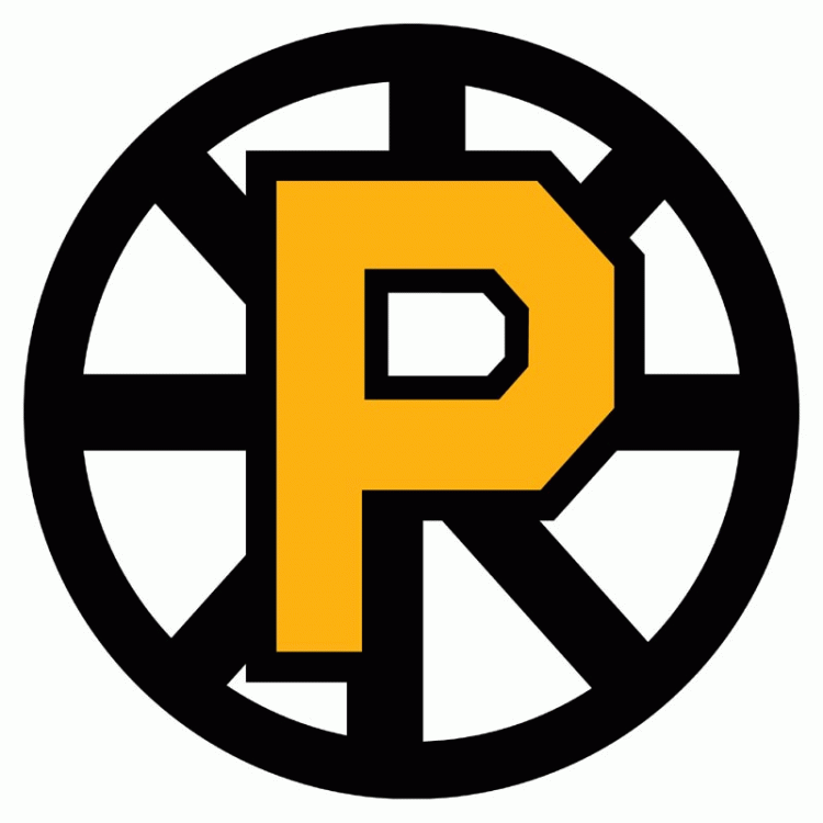
21: Providence Bruins: L: 2; N: 3; C: 4; H: 2
Last on my run of four AHL mimicking franchises is the Providence Bruins, which inherited a logo and color scheme from its NHL affiliate Boston by simply cutting off the bottom right corner of the Bruins’ “Hub” B. The secondary/alternate logos seem to work better for Providence, which would make it stand out a bit more in the AHL. However, I certainly miss a previous version of this franchise, the Maine Mariners, which had a fun, if maybe a bit comical, look. The old Providence Reds also represent one of the league’s great historic franchises.
The AHL’s Best and Worst Logos, Teams 20-11 … Teams 10-1.

I still like the old Admirals logo
It may get be in trouble here, but I actually like the Rockford logo. I don’t really know why, I just do. It probably helps that I also love their giant pig (ice hog) blimp. I’m not sure if they still have that, but the last time I was down there for a game a couple seasons ago they did and it was awesome.
I do like the Rockford logo, more than many others in the league, but not enough to place it higher than #26. The goofy lettering is a big drawback, and the fact that it is named after a pig isn’t doing it any favors. That being said, it hardly belongs at the very bottom. Creativity does help Rockford’s logo quite a bit, and I will fully admit that it is more creative than any of the NHL copycats listed below it on this list of 30-21.
Yeah, I’m not a big fan of the NHL copycat logos. Get some creativity!