

It was a historic night for the Milwaukee Admirals as they introduced a brand new era in the franchise’s history. The team’s image has gone through a complete overhaul ahead of the 2015-16 season and, like each rebranding that has taken place in team history, the new look of the Admirals is a drastic change to the one before it. The great news is that this look and identity is entirely their own in a league filled with teams that mirror their parent NHL affiliates. This is not the Milwaukee Nashville Predators. This is the Milwaukee Admirals.
![]()
![]()
![]()


Press Release via Milwaukee Admirals:
Milwaukee, WI—The Milwaukee Admirals are excited to usher in a new chapter in team history with the unveiling of a bold new logo and jerseys.
The new logo is an evolution of the Admirals last logo and features a more fierce and determined sailor. The sailor is accented by the upper portion of a naval uniform and a hat that was inspired by the one worn by the Admirals “Captain Crunch” logo from the late 70s and early 80s. The hat is adorned with an “A” composed by three bones.
The Admirals secondary mark, dubbed the M&A, is the letters “M” and “A” interwoven in bone script and connected with a hockey stick for the horizontal bar of the “A”.
The primary color of the new look now shifts to navy blue (Pantone 282) with the same Lake Michigan blue (Pantone 292) accents used with the previous logo and a gray outline.
The Admirals new jerseys will both feature the head of the sailor on the front of the with the M&A mark on both of the shoulders. The home sweater will be primarily white with navy blue sleeves, accented by Lake Michigan blue piping and a touch of gray separating the two blues. The road jerseys will be navy blue with Lake Michigan blue sleeves and white accents.
The Ads will continue use of their third jersey from previous seasons that featured the popular full body logo. The only difference is the black in the full body logo is replaced with navy.
The new look was conceived in coordination with Studio Simon, a sports brand identity development company out of Louisville, KY. Studio Simon is one of the leaders in sports brand identity development and has teamed up with over 100 professional, collegiate, and amateur teams, leagues, and businesses including the NFL, the Minnesota Twins, and the Kentucky Derby.
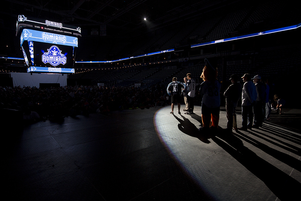
First things first, the event to unveil the brand new identity of the Admirals was sensational to be part of. It felt as if there was more than an average attendance to a game inside the BMO Harris Bradley Center and hearing the immediate reaction of fans as the logos were unveiled on the jumbo-tron was electric. Didn’t get the chance to attend? Sad, but great news! As the Admirals recorded the event so you can watch it all in its YouTube glory:
I feel that the immediate thing that jumps out is the revamped color palette. The team has dropped a more simplistic “black, white, and baby blue” look and gone for something different. The “Lake Michigan” blue we’ve become used to remains but it is now accompanied by a slightly lightened shade of navy blue along with white and a small touch of gray. It makes me think of the Pittsburgh Penguins colors used during the Winter Classic. I’ve always been a big fan of that look. And I think this will work well in Milwaukee.
What comes next is something of an epidemic taking hold of so many professional sports teams right now which is to make the caricature representing the team’s logo look very -very- angry. The Milwaukee Bucks are guilty of doing this exact same thing not too long ago. “But, it’s a skeleton. How does one make a skeleton of a pirate playful yet still aggressive?” Well, friend, I’ll tell you how: this. The problem is of course finding the balance between fun and aggressive when dealing with a team name such as the Admirals in the sport of hockey. The team went the fun route. It lasted about 10 years – which by AHL standards is incredible. Now, it’s time that they try doing in a more mean and hard hitting approach. It’s different but a good different.
The new logo seems to not only carry over from some of the previous logo but also play off of the old Captain Crunch logo. It’s as if the team has taken those two worlds and wrapped them up with a mean exterior. The problem is that these angry looking logos right now feel cliche right now. I know using a skeleton in a pirate theme puts you in a corner design wise but I even see this looking like a blue version of the current Tampa Bay Buccaneers logo… or as Ryan Miller brilliantly pointed out at the event, Skeletor.
There is plenty to like though. The main logo graphic with the team name and star looks great. I’m a fan of the “A” in the Admirals hat as a motif to logos of old. I also think that the hidden “M” in the collar of the pirate is a clever hidden detail. Best of all. The head logo looks great on the jersey. Speaking of which.
My first actual glance of the new uniforms came via PDF. I included the images of them up above. My impression was that the color scheme didn’t appear to match the actual colors used in the logos. It reminded me more of those Charlotte Hornets uniforms that the Checkers rolled out last season. In short, I didn’t just want to see them in person tonight to pass judgement I needed to see them in person before thinking anything of them. What’s the result then? Good.
The Admirals are going from simple to a look that feels loud at first – but is eerily similar in qualities to what it is replacing. The black is swapped out by navy basically while the Admirals ditched a ye olde Reebok Edge uniform template in favor of something a touch different. The color on the shoulders running to the sleeves? Still there. The color that runs down the side panels underneath the arms? Still there. Socks that have the previous color blocking design on them? Same, just different colors being used as with the uniform set.
If there were any real downers for me in this unveiling it is the interlocking “M&A” bones logo and the “new” third uniform. Let’s just squash it now. The third uniform is the old third uniform that we know and love all the way down to the old logo (yes, the old logo) still being there. All that has changed is that the black has been replaced by navy on the uniform, the new fonts for name and numbers, and that is it. Weirdly, even the anchor bones logo is still on that third jersey. Which brings me to the “M&A” logo that is replacing it on the shoulders. It was very well received at the event and in social media. But it is a logo that is a major downgrade to me as opposed to the anchor logos used on the sleeves previously. It’s trying to be the Milwaukee Brewers interlocked MB logo from the 90’s but does so in a construction that looks like a tangled mess. Interlocked logos as shoulder patches on hockey jerseys don’t seem to make sense to me. It’s sloppy. Which is strange considering how crisp the “A” looks when standing alone. It looks awesome on the new Admiral caricature’s and Roscoe’s hat. Why muck it up by plopping more bones atop it and threading a hockey stick into it?
Another thing that I didn’t detect until looking at the Scott Paulus photos when I arrived home was the numbers from last season are back. No, not the font style but -if you look very closely at the third uniform’s arm numerals- the way that they applied to the jersey is the same as last season. They aren’t patches. They aren’t stitched. They’re effectively screen printed, cut up into odd shapes, and applied directly to the uniform. It was a weird change that started last season and I’m not sure if it was purely an Admirals only move or if the AHL’s CCM branding change had anything to do with it. In fact, it is such a small detail that I didn’t catch it until a few games into last season. Some fans purchasing the game-used jerseys at the Admirals Garage Sale weren’t as thrilled about how those looked compared to actual stitched names and numerals. Sadly for those in that boat it looks like more of the same.
All things said. I think this new look will take some time to grow on me but it is also quite sharp. It’s actually not that drastic of a departure from what the Admirals are moving away from but is different enough to really pop. At the end of the day I think that’s the whole goal of a rebrand. And the Admirals did a solid job.
What is your reaction to the brand new look of the Milwaukee Admirals? How would you grade them? Which uniform is your favorite?
Be sure to follow Admirals Roundtable on Twitter, like us on Facebook, and see our photos on Instagram.

I agree wholeheartedly on your assessment.
I like the new pirate logo, I really dislike the M&A logo.
I can not wait until October to see them in action.
Like poproc, I agree with your assessment as well. It will take me some time to get used to, because I really liked the simplicity of the white/black/baby blue. The blue popped so much on the road blacks, and it made for a sweet looking sweater. The M&A is a great idea in concept, and I still like the logo, but it is so busy and hard to see. I do think it looks better on the jerseys than online though, so hopefully it’ll look better on merch too.
I get chills when I watch the unveiling video and they show the new “mean” admiral and everybody goes “OOOHHHH!” I was at the event, and went “OOOHH!” too, but didn’t realize that many other people did.
Now, the third jersey – WHAT THE F?! How can you re-brand yourself and keep an old logo on a jersey that you’ll wear??! That is a bad, bad miss for me, and just seems so amateurish. That being said, I love the old logo so I guess I am kind of glad that we’ll be wearing it a little bit, but all in all, how can you keep an old logo on a jersey?! Ridiculous to me. Should’ve put the new “A” on the shoulders and should have put the full bodied Admiral with “Milwaukee Admirals” on the chest.
The new home and roads, I am glad they still kept the laces on the neck, I’ve always loved that. The logo on the front of the sweater reminds me A LOT of the SC Stingrays! (https://ismmedia.com/stingrayshockey.com/ISM3/thumbcache/6dc87a603edb34a7c48ac8e66644bb27.500.jpg) Just the overall shape of it. I think that these jerseys will grow on me, but I am not going to set out to buy one really anytime soon unfortunately. When I see Austin Watson burying some slappers into net, and the ensuing celly, I am sure I’ll start wanting one of these jerseys.
P.S. I REALLLLLY hope that we keep wearing the ball-in-glove Brewers logo on our sweaters. I think that we have to, right? That makes me think that last night’s jerseys weren’t “game ready” – which leads me to believe that the weird patch number situation will be fixed before the season starts. Just my two cents!
Overall, I like the look. To me they really didn’t do a whole lot other then change black to navy blue, drop the anchors and instead of a skeleton kid we have an adult skeleton. But I think it looks alright. The shoulder “M&A” is too busy though. I agree that it looks a bit of a mess, and it can be hard to understand if you don’t know what it is. As far as the lettering goes I noticed it before the first month was over last season. We appear to be the only team in the AHL at least to be using screen printed lettering. Immediately I thought it looked cheap and I asked about it. I was told it comes from a company out of Denver that the equipment manager recommended and it costs the same amount as the authentic lettering but it’s easier to sew on. I argued that it made the jerseys look cheap and not completely authentic. I was told that only a jersey being game worn makes it authentic and we need to get used to this lettering because it’s here to stay. So therefore I didn’t buy any game worn jerseys this summer I will not buy any until the authentic lettering is back. If it were true that a jersey is only authentic if it’s game worn means you could throw a replica on players and still charge $700 at the garage sale. So, I will not be buying.