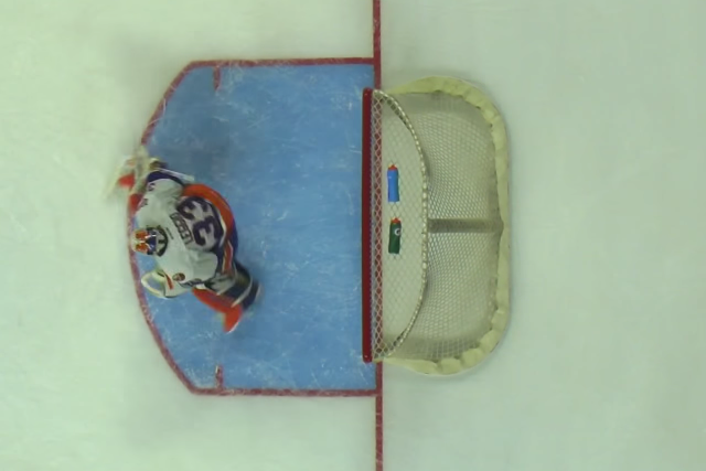
An overhead look at Bridgeport goaltender David Leggio, via The Hockey News
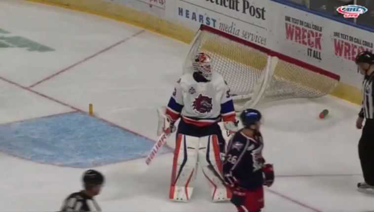
It’s official, the AHL now has a brand new “Leggio” rule in place to deter the manuever pulled by Bridgeport goaltender David Leggio. If such an instance were to occur again, the goaltender would get a game misconduct (resulting in an ejection of that player), with a penalty shot awarded to any player on the ice at the time for the opposing team.
On Thursday, the AHL announced a brand new rule change to prevent any further occurrences of this sort, instituting an automatic game misconduct for the offending goaltender and allowing for the opposing team to select any shooter from the ice to take the penalty shot on the replacement goaltender.
In case you missed the play, the Sound Tigers released a new camera angle showing Leggio’s clearly blatant dislodging of the net:
So Roundtable . . . What do you think of the conclusion of the Leggio saga? Should the AHL allowed more referee discretion on plays like this one to award a goal for the opposing team?
Be sure to follow Admirals Roundtable on Twitter, like us on Facebook, and see our photos on Instagram.
Every once in a while a play comes around that forces a change in hockey’s rule book. One of the most famous was the Sean Avery rule, concerning the forward’s unique method of screen goaltender Martin Brodeur, or Los Angeles forward Jarret Stoll’shand on the puck defensive zone faceoff rule that went into effect after the Kings’ 2012 Stanley Cup run. Detroit fans are probably still clamoring for some rule changes after this horrendous no goal call last week.
On Sunday the AHL had a play likely to lead to a rule change in the not too distant future. Bridgeport Sound Tigers goaltender David Leggio pulled an interesting little trick in a game against Springfield:
Call it bush league or call it whatever you want, but Leggio successfully ended a two-on-none shorthanded breakaway coming at him by blatantly knocking the net off its pegs, giving Falcons forward Dana Tyrell a penalty shot. Leggio proceeded to stop the attempt, making the play all that more ingenious.
Afterwards via Twitter, the 30-year-old goalie played coy about the crafty maneuver, using the opportunity to plug his goalie clinics:
We teach knocking off nets in the summer at Leggio Goaltending, along with fixing a “broke” strap and patching bad ice when your tired
So Roundtable . . . What do you think of Leggio’s decision? Was it intelligent or bush league? What is the most unusual thing you’ve seen at an AHL game?
Be sure to follow Admirals Roundtable on Twitter, like us on Facebook, and see our photos on Instagram.
Rich Clune dressed in 106 games with Nashville, including one this season. Photo via Predators.NHL.com.
Yesterday, my colleague Daniel Lavenderspeculated on what it would mean to Milwaukee, and notably popular Admirals forward Michael Liambas, if Nashville Predators forward Rich Clune cleared waivers. Today, as expected, Clune cleared waivers and was assigned to Milwaukee. Therefore, tonight against Iowa we will all find out the 25-year-old’s plans and Milwaukee/Nashville’s plans for him, and Liambas, going forward.
Clune’s spot in Nashville will be taken by forward Matt Cullen, who is returning from the IR. Clune, a Toronto native, and known NHL enforcer (166 PIMs last season with the Predators) becomes the latest light scoring, tough guy to clear through waivers into the American Hockey League. Thanks in part to boon in the use of advanced stats, many NHL teams seem inclined to move away from utilizing a classic low scoring enforcer (see Colton Orr) on their lower lines and instead employ third and fourth line checkers that can also fight if need be (see David Clarkson).
If this in fact Clune’s final go-around with Nashville, the popular winger will have dressed in 106 NHL games with the team, scoring seven goals and 16 points, along with collecting 279 PIMs.
If Clune does dress with the Admirals, this will be his third stint in the AHL after playing for the now extinct Iowa Stars (2007-2008) and formerly more colorful Manchester Monarchs (2008-2013). He also saw 14 games with the Los Angeles Kings in 2009-2010.
So Roundtable . . . Are you excited to see Clune in Milwaukee? Along with a great Twitter handle, what can he bring to the Admirals?
Former Admirals Ryan Ellis and Pekka Rinne helped the Predators defeat Ottawa 3-2 in Nashville’s season opener. Photo via Predators.NHL.com by John Russell/NHLI via Getty Images
One night before the Milwaukee takes the ice for their first game of the season against Charlotte, the Admirals NHL Affiliate Nashville opened its 2014-2015 campaign with a 3-2 home victory against Ottawa.
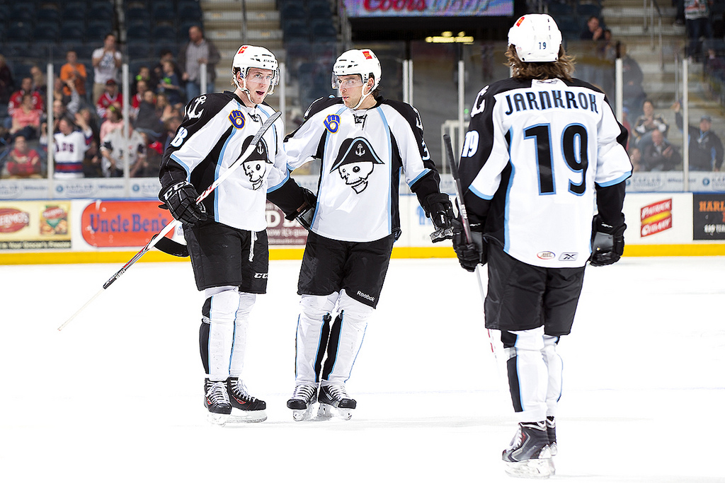
Several ex-Admirals made the Predators’ opening night lineup, include three, Filip Forsberg, Calle Järnkrok and Pekka Rinne, that dressed in games with Milwaukee last season. Forsberg got off to a terrific start in Nashville, picking up a pair of assists in 15:11 of ice time. The 20-year-old Swede’s first point came on a beautiful setup of Craig Smith‘s power play tally, while his second on a forced turnover contributed to Eric Nystrom‘s third period game winner.
Forsberg’s fellow Swedish countryman Jarnkrok had a much slower night, going pointless in 13:07. Meanwhile, Rinne looked like his old self on a relatively quiet night, stopping 18 of 20 shots to pick up his first win of the season.
Other former Admirals in Nashville’s opening night lineup, included Ryan Ellis, Shea Weber, Mattias Ekholm, Colin Wilson, Gabriel Bourque, Roman Josi and the earlier mentioned Madison, Wisconsin native Smith. Therefore, half of the Predators dressed skaters (10 altogether) enjoyed at least one stop in Milwaukee during their careers.
One longtime former Predator, David Legwand, suited up for the Senators in the debut contest. Nashville’s first-ever draft pick enjoyed this inglorious moment when he was called for a tripping penalty in the second period.
Jarnkrok and Forsberg’s ex-Admirals mates take to the ice tonight in Milwaukee’s 2014-2015 debut at the BMO Harris Bradley Center. You can read my season preview on MilwaukeeAdmirals.com.
So Roundtable . . . What did you think of Nashville’s first game of the season? Do you think we’ve seen the last of Calle Jarnkork and Filip Forsberg in Milwaukee? When Nashville comes calling for a forward or a defenseman, who do you think is going to be the Predators first call up?
Be sure to follow Admirals Roundtable on Twitter, like us on Facebook, and see our photos on Instagram.
Defenseman Ryan Ellis impressed in Milwaukee for 61 regular season and 11 more playoff games from 2011-2013, scoring 10 goals and 24 assists. (Photo Credit: Scott Paulus // Predators.NHL.com)
After a long summer of waiting, former Milwaukee Admirals defenseman Ryan Ellis has re-signed with the Nashville Predators to the tune of 5 years and $12.5 million. The new contract starts at $1.5 million in for the upcoming campaign – growing up to $3.5 million in 2018-2019.
The 23-year-old represents one of the Predators’ most important developmental prospects. The former 11th overall pick in 2009 had a breakout season last year as he scored 6 goals and 27 points in 80 games. He also ranked second on the team in plus/minus at +9 behind Craig Smith‘s +16.
Ellis joined Milwaukee for the 2011 Calder Cup playoffs after a stellar four-year run with the Windsor Spitfires. He proceeded to accumulate 10 goals and 24 assists in 72 regular season and playoff games with Milwaukee from 2011-2013, playing part-time with the Admirals in each of his first two professional seasons, before graduating to full-time status in a Predators uniform last year.
So Roundtable . . . What do you think of Nashville’s resigning of Ryan Ellis? Is he a player worth having around for five more years? Any favorite memories of the 5’10” blue liner in Milwaukee? What does his signing mean to current Admirals defenseman moving forward?
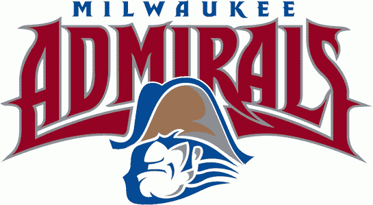
The Milwaukee Admirals IHL logo in use from 1982-1997 is still my all time favorite for any professional team in Milwaukee. Can anyone say throwback night at the BMO Harris Bradley Center?
What makes a great American Hockey League logo? It is history, style, colors, modernization, or none/all of the above? Today I will spell it out by choose the league’s top ten best logos.
The teams it won’t be are from Wednesday’s 30-21 list: Syracuse (30), Iowa (29), Hartford (28), Binghamton (27), Rockford (26), Bridgeport (25), Worcester (24), Albany (23), Texas (22) and Providence (21); and from Thursday’s 20-11 list: Springfield (20), Lehigh Valley (19), Adirondack (18), Hamilton (17), Chicago (16), Charlotte (15), Lake Erie (14), Norfolk (13), Wilkes-Barre/Scranton (12), Manchester (11).
Without further ado, here are the AHL’s best ten logos, starting with number 10, the Utica Comets. Check back later for my five best and worst logos from AHL teams of the past, and analysis of all four Milwaukee Admirals logos, ranked best to worst.
Author’s Note: Separate points are listed for Artistry of the Logo (on a 1-5 scale), Team Name, Color Scheme; and Logo/Team Name History. All logos were gathered from Chris Creamer’s Sportslogos.net.
10: Utica Comets: L: 4; N: 5; C: 4; H: 2
Kicking off the top ten best AHL logos is the Utica Comets, coming off their first AHL season. Despite a fairly short history in Utica, the Comets give a fresh look to one of the AHL’s most historic franchises (was formerly the Peoria Rivermen, Springfield Indians and Worcester IceCats to name a few of its stops). The crest itself is extremely sharp and modern, pulling in the green and blue in line with the recent version of their Orca-crested NHL affiliate Vancouver. The streaking hockey puck, with its Comets’ tail also looks cool. Overall, this is a great modern logo addition to the AHL. Bonus points are deserved for a much better look than the old Utica Devils.
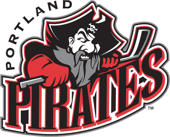
9: Portland Pirates: L: 3; N: 5; C: 4; H: 4
The Portland Pirates were a tough team to place in this ranking, because I actually prefer the franchise’s former logo, which had a rounded head of a Pirate, complete with bandana, facial jewelry and a stick sword in its mouth. This is one of my favorite relics of the 1990s, when Barry Trotz coached one of the AHL’s top teams. The newer version did noticeably modernize the logo, with a tough Pirate holding onto a stick, with one eye looking back. The lettering, though excessive throughout both logos, is sharp and matches the Pirate’s motif and the vivid red and black colors.
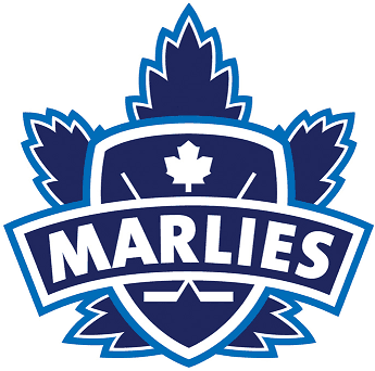
8: Toronto Marlies: L: 4; N: 4; C: 4; H: 4
Over the years Toronto, hockey’s heart, has been home to numerous professional franchises. One of my favorites from the Queen City is the Toronto Marlies, the current affiliate of the Toronto Maple Leafs, which practices in the same facility as its big NHL brother. I actually prefer the Marlies’ Maple Leaf crest and alternate crest to the current NHL version, as these harken back to an dressier older version of Toronto’s NHL team that really stood out. The fact that the team represents a nice homage to the famed former Toronto Marlboros, is an added bonus. Much like the Manchester Monarchs, this is a great way keep the two franchises tied together, but allows each to still stand alone.
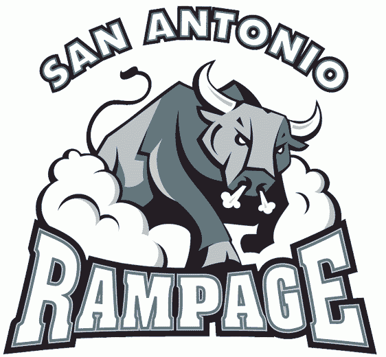
7: San Antonio Rampage: L: 3; N: 4; C: 5; H: 4
Opinions tend to be varied on the logo/jerseys of the San Antonio Rampage. Some, like myself, love the ticked off, stampeding bull, bathed in silver and black (one of hockey’s best color schemes) for a nice match to the ownerships’ San Antonio Spurs of the NBA. Others find it bit too cartoonish. One of my favorite aspects of this logo, is that it represents a full-size bull in motion (note the dust cloud), with not just the head on the crest. Though Florida’s AHL affiliate has rarely had much success on the ice, at least the logo and jersey look stylish.
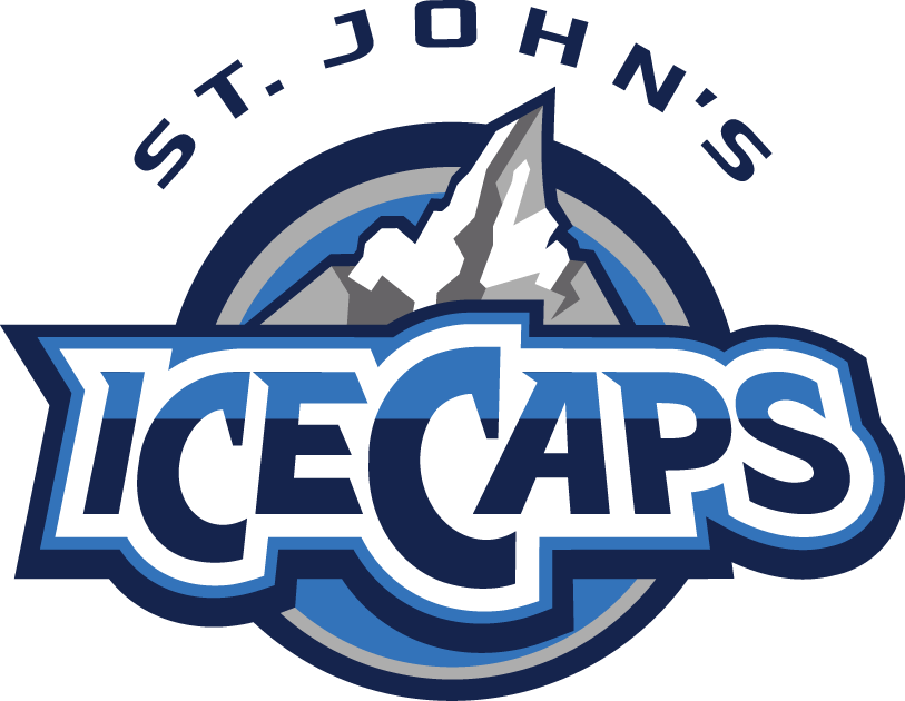
6: St. John’s IceCaps: L: 3; N: 5; C: 5; H: 4
It is easy to be partial toward the St. John’s IceCaps, one of the AHL’s most successfully run franchises located in near-isolation on the island of Newfoundland. The IceCaps, which borrow the primary colors of their NHL affiliate Winnipeg Jets, pull the off the grays and blues better than their parent club, and feature an Iceberg logo much more interesting than the Jets. Much like the moniker Penguins, IceCaps is a terrific hockey nickname and very appropriate for a sport played on a sheet of ice. Meanwhile, the lettering and slightly off center iceberg really standout, providing an effective modernist tone.
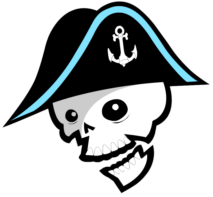
5: Milwaukee Admirals: L: 4; N: 4; C: 4; H: 5
After a somewhat bland prior edition of its logo, the Milwaukee Admirals fired back with a radical new look for the 2006-2007 season. This decision was not without a bit of controversy as the new skeletal look had its share of detractors. However, the biggest issue facing the Admirals is that its alternate logo looks even better than its primary logo does, as it’s hard not to love a skeletal pirate, dressed in full Admiral garb with a peg leg, shooting a puck with his removed boney foot. The regular logo is just the head, but looks artistic with its black and Lake Michigan blue trim hat decorated with an always popular anchor logo. The way both of these logos, which are really without anything comparable in the AHL, look on either a blue or black jersey is really crisp, and are a major contrast to the bright yellow color of Milwaukee’s NHL affiliate, the Nashville Predators.
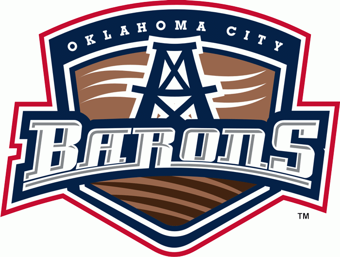
4: Oklahoma City Barons: L: 3; N: 5; C: 5; H: 4
Even though the Oklahoma City Barons’ logo could be considered a bit bland like its NHL affiliate in Edmonton, there are many things that work well for OKC. First off the colors and name are a great homage to the Oilers without being a perfect match, giving each club its own identity. Second the oil derrick and waived line accents really work really well artistically. If I had one criticism it would be the unnecessary use of putting the name Oklahoma City at the top of the crest, but that does help Oklahoma’s oil Barons standout from the former Cleveland Barons.
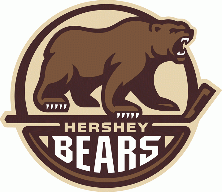
3: Hershey Bears: L: 5; N: 4; C: 5; H: 5
Kicking off the top three best logos is the longest continuously operating member of the American Hockey League, the Hershey Bears. The Bears back up that history with a logo that has evolved over the years, modernizing with the times before settling in for the 2012-2013 campaign with a great throwback-styled log. It is certainly much improved over Hershey’s primary 2000s logo). The wording Hershey Bears is unnecessary here for Washington’s AHL affiliate, because what really steps to the forefront is the mean cocoa brown bear standing on top of a hockey stick. Bonus points are certainly deserved for a team making the city’s signature chocolate color work so effectively in jerseys and logos of its professional hockey franchise. The Providence Bruins could learn a lot from the look of this ferocious Bear.
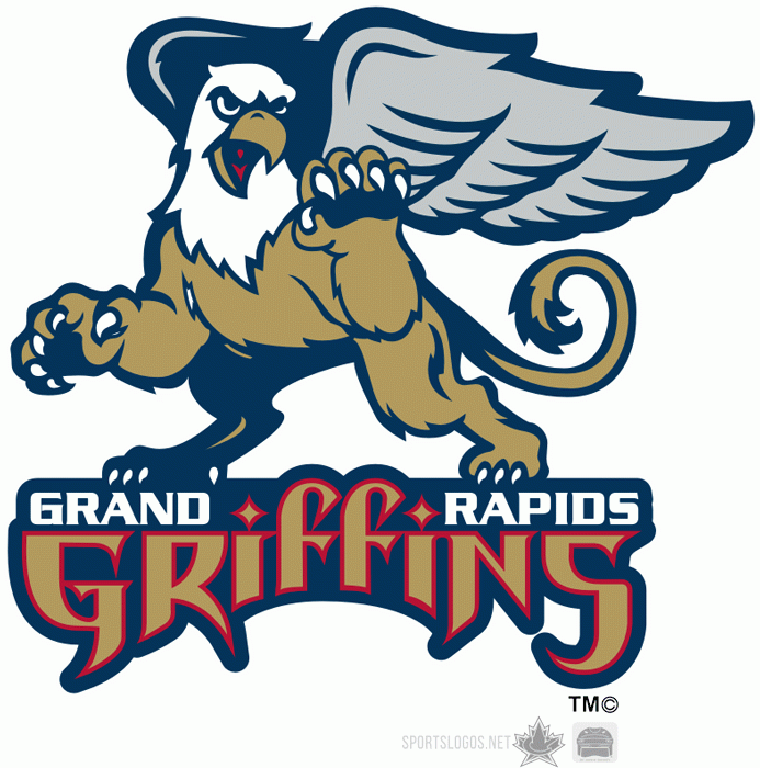
2: Grand Rapids Griffins: L: 5; N: 5; C: 5; H: 4
The team that represents the best modern look in the American Hockey League is the Grand Rapids Griffins. First off, the choice of a Griffin as a mascot is absolutely inspired. This is a great alliterative moniker that is both fearsome and mythical. The nickname lettering itself is medieval cool. Note the selective placement of the city name Grand Rapids and the stylish diamond dotted “I”s in Griffins. Though this team has strong ties to its NHL affiliate in Detroit, it actually started as an independent franchise in the IHL. Despite some of its red and white alternate logos, Grand Rapids has managed to keep its iconic gold, blue, silver and red trim look that dates back to its inception.
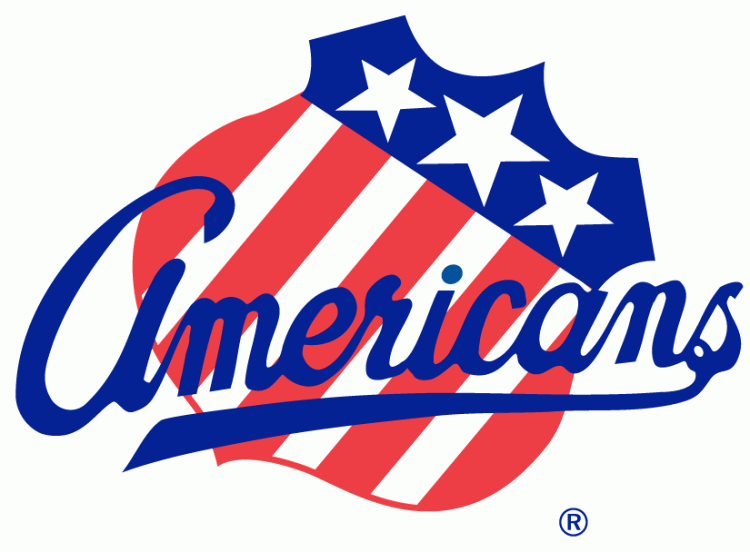
1: Rochester Americans: L: 5; N: 5; C: 5; H: 5
My choice for the American Hockey League’s best logo was an easy one, as the Rochester Americans feature the AHL’s most historic logo and the oldest one that still in use. There is beautiful simplicity with the Rochester’s patriotic red, white and blue shield logo, which features scripted Americans lettering. Originally crafted for the 1972-1973 season, this iconic crest represents just the fourth logo in franchise history, and might stay that way for a while (Rochester’s shield crest itself as the primary logo on jerseys dates back to 1959-1960). If Buffalo’s AHL affiliate would ever decide to modernize a little bit, adding some shadowing would be an easy touch up for this logo. But even as is Rochester stands at the head of the class as having the AHL’s best logo, a far cry from its geographic rival Syracuse, which in my opinion has the league’s worst logo.
So Roundtable . . . What is your pick for the AHL’s Best Logo and/or AHL’s Worst Logo? Where does Milwaukee’s logo fit? Is No. 5 too high, too low, or just right? If you could change the Admirals logo, what would you do?
Prior to a radical change for 2006-2007, Milwaukee utilized this wordy logo from 1997-2006. Did you enjoy this version of the Admirals logo or were you glad to see it go by the wayside?
Today I’m tackling the middle ground of AHL logos, numbers 20 through 11 on a list of the best and worst of team crests. Wednesday saw Syracuse (30), Iowa (29), Hartford (28), Binghamton (27), Rockford (26), Bridgeport (25), Worcester (24), Albany (23), Texas (22) and Providence (21) knocked out of the running for the AHL’s best logo. Without further ado, here are the next ten, starting with number 20, the Springfield Falcons.
Author’s Note: Separate points are listed for Artistry of the Logo (on a 1-5 scale), Team Name, Color Scheme; and Logo/Team Name History. All logos were gathered from Chris Creamer’s Sportslogos.net.
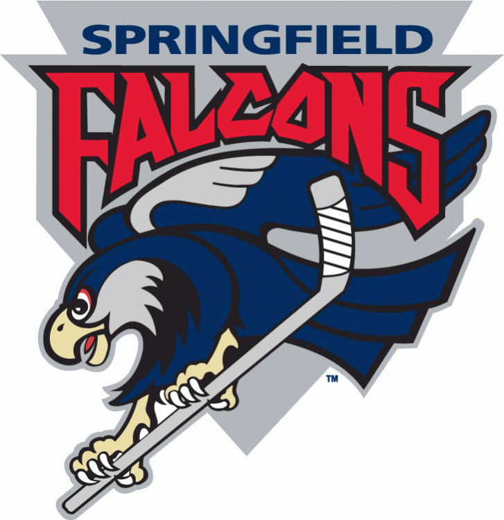
20: Springfield Falcons: L: 3; N: 2: C: 3; H: 2
After the famed Springfield Indians moved to Worcester in 1994, the AHL’s base received another franchise in the Falcons. Due to the trademark, and perhaps other reasons relating to the current Native American issues concerning the former University of North Dakota Fighting Sioux and current Washington Redskins, Springfield adopted the new moniker and a rather dull bird head logo with limiting colors. However, in later years the franchise adopted a much more interesting full bird crest grabbing a stick with its talons, plus a red and blue color scheme. Though the new team lacks the history and tradition of the earlier Indians, this logo keeps getting better with age.
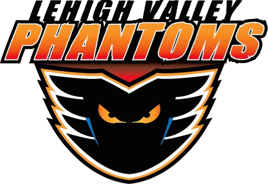
I have always enjoyed the moniker for the Phantoms and how well this logo works with Philadelphia’s black and orange color scheme, even it is a bit on the darker side of team nicknames. Credit to the organization for getting rid of its 1990s lettering, but the big drawback here is simply the location name of Lehigh Valley. I’m not sure why this team can’t just be the Allentown Phantoms, but maybe that might help the new squad draw from a larger vicinity audience.
18: Adirondack Flames: L: 3; N: 1; C: 2; H: 2
On lists of the best and worst AHL logos, I’m guessing that this new team’s support would be all over the map. Some like me, love Adirondack’s throwback to the older Atlanta Flames “A” logo, while others might find it a bit too simple and not terribly creative, like Calgary’s “C”, which I always thought looked better during the 1980s. What this logo does represent is the end of the four season run of the AHL’s distant Northwest outpost franchise, the Abbotsford Heat, which despite featuring a great nickname had an extremely plain logo. Bonus points here too for a terrific alternative flaming “A” logo.
17: Hamilton Bulldogs: L: 2; N: 3; C: 3; H: 3
Hamilton was one of the hardest teams to place on this list. The Bulldogs logo itself is a bit on the bland side, though I enjoy the dog collar, sharp teeth, face wrinkles and roughed up bone. The background triangle crest seems a bit unnecessary, and again this logo is just a bulldog head, another drawback. However, the Bulldogs moniker is a great hockey nickname with a lot of history attached to it. Despite this I would rather the team be called the Hamilton Tigers, a throwback to a long-lost member of the NHL that featured extremely sharp yellow and black colors. Considering the fact that Hamilton is Montreal’s AHL affiliate, it is probably better that the AHL’s Bulldogs are not Black and Gold.
16: Chicago Wolves: L: 2, N: 4; C: 3; H: 3
Originally, the Chicago Wolves ranked much lower on this list due to the simplicity of its creepy wolf head, stick and giant hockey puck logo. But delving deeper, this crest really deserves a better ranking when compared to its peers. The Wolves jerseys, which feature a vivid color scheme, proudly represent one of the AHL’s best modern franchises, born out of Chicago-area hockey fans’ desire to watch affordable professional games (the team posts terrific attendance figures during the frequent labor stoppages of the NHL). I am curious to see what the future holds for Chicago, its logo and its colors, especially if the decision is made to modernize the jersey and/or pull closer to its affiliate the St. Louis Blues, a bitter rival in this part of the country. That certainly didn’t work out too well for Calgary with Abbotsford in nearby Vancouver country.
15: Charlotte Checkers: L: 3; N: 4; C: 3; H: 3
The Charlotte Checkers represent another minor league franchise that moved up leagues, this time from the ECHL to the AHL. Interestingly, the Checkers have managed to one-up their NHL affiliate Carolina (which finished last in the Hockey News recent NHL logo rankings) with their sharp logo, fun nickname, and snazzy color scheme. What perhaps most impressive about the Checkers logo is how it emerged from the shadows of some truly awful prior versions dating back to the 1990s. I’m sure Charlotte still has its detractors, but I think this made for a great addition to the AHL back in 2010, and offered a close geographic rival for Norfolk.
14: Lake Erie Monsters: L: 3; N: 4; C: 2; H: 3
Lake Erie is easily one of the most controversial choices on this list, thanks to both its name and logo, but I have a soft spot for the Monsters. First off, the nickname comes from a great historical reference, Bessie, the alleged Lake Erie Monster. Second, the sharp eyes coming out of the water on the logo are quite intimidating. The big issues here are the excessive use of words on the logo (“Cleveland” was recently added, to go along with the original version), and the fact that this franchise replaced one of my IHL/AHL favorites, the Denver/Utah Grizzlies, whose nickname didn’t really fit in Ohio. Historically the Barons represent a lot of hockey history in the Cleveland area, but it was always a franchise that never lasted too long in town. Therefore, the Lake Erie Monsters make sense as a new face of hockey on the Cuyahoga.
13: Norfolk Admirals: L: 2; N: 4; C: 3; H: 4
Though Norfolk represents the AHL’s “other” Admirals for those of us that live in Wisconsin, this area is plenty deserving of also using the nickname considering its impressive naval history. There is also some fun franchise history here, as the Admirals were formerly the Hampton Roads Admirals of the ECHL, before becoming the Norfolk Admirals in the AHL. Norfolk’s logo itself has many pluses and minuses. The positives are its hockey puck cannons, bright colors, battleship and the five stars. The negative is the fact that there is just too much going on throughout this logo, despite all of its interesting elements.
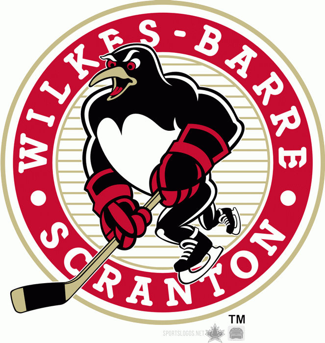
I might get some negative feedback for ranking the Wilkes-Barre/Scranton Penguins, one of America’s favorite minor league franchises and mascots, not in the top 10, but there are some good reasons for its placement here. First, I’m guessing that most Admirals Roundtable followers don’t have to write out the mouthful name Wilkes-Barre/Scranton as frequently as I or any other AHL media member does. Simply put, it’s a pain, a 21-character pain that appears right on the logo’s crest. Second, there isn’t much creativity here since again the Penguins’ name is an exact match of its NHL affiliate in Pittsburgh. However, it’s hard to dislike the sharpness of this version of the Penguins, or its red and black, rather than black and gold, colors, and its mascot Tux. Bonus points are also deserved for some fun alternate logos.
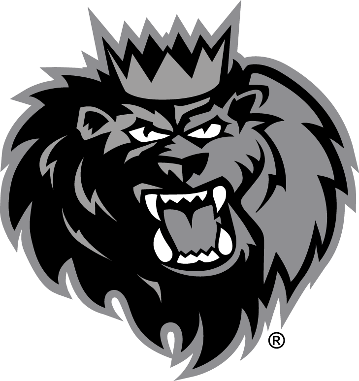
11: Manchester Monarchs: L: 3; N: 4; C: 4; H: 3
The Manchester Monarchs are the perfect example of AHL team borrowing from its NHL affiliate in Los Angeles, but really making it work. First off, they are not the Manchester Kings, but rather the Manchester Monarchs, an alliterative name that means basically the same thing. That alone is brilliant. The second thing that worked here are the colors, as Manchester originally brought in the royal gold and purple long associated with Kings and Queens and its affiliate in Los Angeles. The Monarchs recently changed to Silver and Black to better mesh with the Kings, but it did take away a bit of this franchise’s uniqueness. The lion logo (king of the jungle) is also a perfect choice of mascot, but its drawback is that the crest is just a cartoonish head in place of what could be more. There still are positives in this logo, notably the cool lion mane, teeth, crown and sharp lettering. I just miss the old purple and gold.
Where would you rank the Milwaukee Admirals on a list of the best and worst logos in the American Hockey League?
The Hockey News is currently counting down its rankings of all of the NHL’s logos from worst to best. That concept inspired me to ask the question, what are the best and worst logos in the American Hockey League?
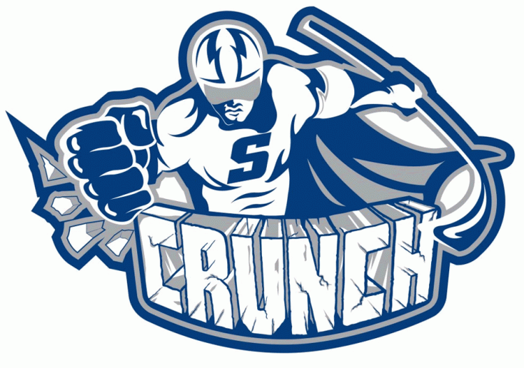
Certainly there are some great AHL jerseys, and some alternative choices that leave little to be desired, but what about just each team’s logos? The AHL has quite the electric mix of team logos and nicknames, from teams that follow strictly the lines of their NHL affiliates, to more cartoonish choices designed to attract family clientele to the rink on any given Saturday night. Some logos are fun, others historic, other hideous. These are my picks for the best and worst logos, starting with the league’s worst, the Syracuse Crunch, and working down to 21.
Check back on Thursday (20-11) and Friday (10-1) for the rest of the AHL.
Author’s Note: Separate points are listed for Artistry of the Logo (on a 1-5 scale), Team Name, Color Scheme; and Logo/Team Name History. All logos were gathered from Chris Creamer’s Sportslogos.net.
30. Syracuse Crunch. L: 1; N: 1; S: 2; H: 1
My pick as the AHL’s weakest team logo is the Syracuse Crunch, for pretty obvious reasons. Amazingly, the current version (unveiled in 2012) is actually better than the two prior versions, 2010 & 1999, which were hypnotic and not in a good way. However, the need for the word Crunch on the logo, plus the cape on “Captain Crunch” leaves little to be desired. Much of the issue here likely stems from the name Crunch, which despite being a nice hockey onomatopoeia makes it difficult to create a snazzy logo.
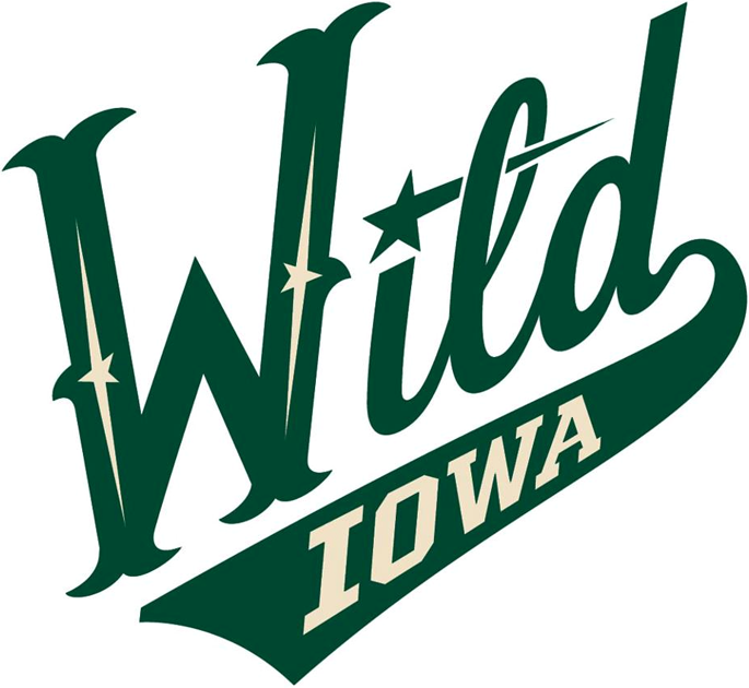
29: Iowa Wild: L: 1; N: 1; S: 3; H: 1
Originality points are certainly lost on the Iowa Wild, which simply borrowed an alternate version of their NHL affiliate Minnesota‘s logo in order to create one of their own. Though Iowa tends to be a rural state, it is not exactly the most “Wild”, so that tends to hurt this choice as well. Finally, the Wild’s logo respresents a unwelcome departure away from the Houston Aeros, which had one of the IHL‘s and AHL‘s best logos along with representing a cool homage to the city’s famed World Hockey Association franchise. Time will tell if the Iowa Wild’s logo will improve in future years and gain something else to distinguish itself from Minnesota, but at the present time this deserves to be near the bottom of this list. The best thing it has going for it? At least it is not the Iowa Chops.
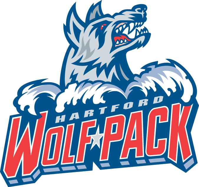
28: Hartford Wolf Pack: L: 2; N: 1; C: 2; H: 1
There is not too much that is terribly unpleasing about the Hartford Wolf Pack fairly bland hockey logo and team name. The issue for me is what this franchise gave up in the process of returning to its original 1997 roots. From 2010-2013 the Wolf Pack became the Connecticut Whale, bringing back one of hockey’s best color schemes and an even better association with the former Hartford Whalers of the NHL, and even earlier the New England Whalers of the WHA. Sadly this was lost again in 2013 when the team transitioned back to a pack of wolves.
27: Binghamton Senators: L: 1; N: 1; C: 3; H: 1
Taking its cues from its NHL parent franchise, the Binghamton Senators’ logo looks similar to Ottawa, if only a bit more cartoonish. The issue here is not the fact that Ottawa doesn’t have a great logo (I think it is middle of the pack for the NHL, Hockey News says 22nd), but why the moniker “Senators” for Binghamton? Simply put there isn’t much originality with this franchise, or with prior AHL teams in the city, but rather a strict association that dates back to Senators inception in New Haven back in 1992-1993.
26: Rockford IceHogs: L: 2; N: 2; C: 3; H: 2
The Rockford IceHogs and their pig biting a stick logo are slowly growing on me as the years pass by. It is a nice homage to the city’s former UHL franchise, while the color scheme fits nicely with its parent Chicago Blackhawks. If I were to make a change here, I would rather the team be called the Rockford Hogs, since I don’t really know what distinguishes an IceHog from a regular pig. The “IceHogs” funky cartoonish lettering is not all that great either.
I happen to be a big fan of the franchise name Bridgeport Sound Tigers (a nice allusion to the Long Island Sound) but this is one of the few redeeming qualities for Bridgeport’s choice of logo. Currently, the logo (which has changed little since its 2001 inception) seems very cartoonish, with just a tiger head and some vibration accents around it. The alternative logos are even worse. With some changes, this could easily move up the list, especially considering the creativity involved in the team name.
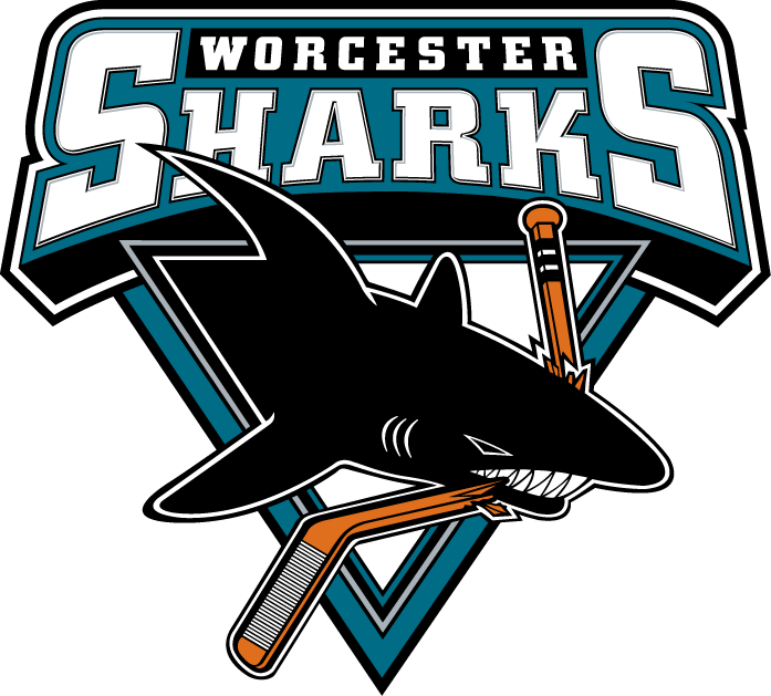
24: Worcester Sharks: L: 2; N: 1; C: 3; H: 1
The next four choices all suffer from their strict associations with their NHL affiliate team names. For the Worcester Sharks, this logo choice really suffers since it is not even an actual coastal city, and I don’t think Sharks are particularly native to Massachusetts Bay, its nearest body of water. What this logo does have going for it is San Jose’s creative base logo and color scheme. I’m not sure why the triangle crest was left in either. Beyond that the Worcester Sharks’ logo just feels very average in the AHL. I kind of miss the old Worcester IceCats, which would be a nice moniker rival for the Rockford IceHogs, but had some of the AHL’s all time worst logos. I also miss the former Shark that played a Baron in Cleveland.
23: Albany Devils: L: 2, N: 2; C: 3; H: 2
Not that there is anything wrong with a full association with a parent NHL franchise, but the creativity tends to suffer for all of the teams that fit in this distinction. For the Albany Devils, the creative “A” Devil logo almost works better than New Jersey’s “NJ” Devils logo (and much, much better than old “U” Utica Devils). Plus I would rather play for a team named the Albany Devils than the former Albany River Rats, which really felt like the minor leagues. However, the top of the “A” almost looks like a halo rather than a pitchfork, bringing up a look too similar to the old California Angels. How ironic.
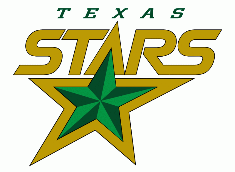
22: Texas Stars: L: 2, N: 3; C: 3; H: 3
The Texas Stars are moving up this list with the help of its parent franchise, which recently ditched much of its inherited look that Dallas brought south from Minnesota with a sharp new green color scheme and lone star crest last season. Texas still retains its old logo, and its name and crest fit very well in its home surroundings of Austin, the capital of the Lone Star State. There isn’t much here that is terribly original (other than the 3D inner star), certainly in comparison to the Texas secondary logo, but it does work well for the Stars.
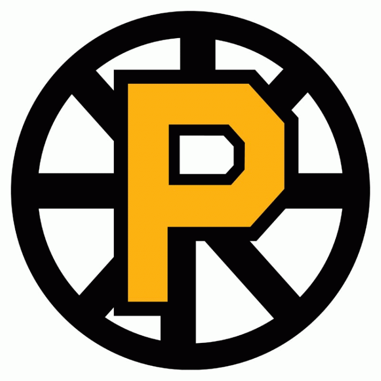
21: Providence Bruins: L: 2; N: 3; C: 4; H: 2
Last on my run of four AHL mimicking franchises is the Providence Bruins, which inherited a logo and color scheme from its NHL affiliate Boston by simply cutting off the bottom right corner of the Bruins’ “Hub” B. The secondary/alternate logos seem to work better for Providence, which would make it stand out a bit more in the AHL. However, I certainly miss a previous version of this franchise, the Maine Mariners, which had a fun, if maybe a bit comical, look. The old Providence Reds also represent one of the league’s great historic franchises.
Admirals forward Mark Van Guilder battles in front during 2013 preseason action at the Kern Center.
Are you ready for the puck to drop on the 2014-2015 Milwaukee Admirals season?
Look no further than October 3, 2014, when Milwaukee will host rival Rockford in their only home warm up test, 7:00 PM at the Kern Center on the campus of MSOE. The following night you can make the short trip down the road to West Meadows Ice Arena in Rolling Meadows, Illinois as the Chicago Wolves will welcome Milwaukee at 7:00 PM.
Milwaukee’s regular season home opener is set for the following weekend on Friday, October 10th, though the opponent, like the rest of the schedule, is still TBD. That is just over two months away!
So Roundtable . . . Are you, like me, counting down the days until October 3? What roster battles are you looking forward to at Admirals training camp?
Colton Sissons and Calle Jarnkrok are among Nashville Predators prospects who may miss out on starting roles at the start of the NHL season. (Photo Credit: Scott Paulus)
In the course of two weeks Nashville Predators General Manager David Poile completed what he set out to do at the start of the preseason: overhaul the team’s center ice position.
So what does that mean for the likes of Jarnkrok and Sissons? Not to mention prospects such as Filip Forsberg, Austin Watson, Pontus Aberg, still unsigned restricted free agent Taylor Beck and any other two-way Predator/Milwaukee Admirals forward? There is no way around the fact that this is a bit of a slap in the face.
Here’s the centers in Nashville right now, I believe: Ribeiro, Roy, Jokinen, Wilson, Cullen, Gaustad, Jarnkrok, Smith, Fisher*.
Here’s the centers in Nashville right now, I believe: Ribeiro, Roy, Jokinen, Wilson, Cullen, Gaustad, Jarnkrok, Smith, Fisher*.
— Kristopher Martel (@ThePredatorial) July 15, 2014
Poile: The younger guys are a bit of a tease this time of yr. Veteran players give you a better chance and this is the path we’ve chosen.
Poile: The younger guys are a bit of a tease this time of yr. Veteran players give you a better chance and this is the path we’ve chosen.
— Cellblock 303 (@Cellblock303) July 15, 2014
In his press conference this morning, Poile mentioned some potential Predators roster plans that would have Jarnkrok included:
Poile said Wilson and Cullen could end up on wing. Says he thinks Jarnkrok will still win a spot … — JoshuaCooper (@JoshuaCooper) July 15, 2014
Poile – if Mike gets a chance to play with Neal, Derek will get a chance to play with Smith. — Nashville Predators (@PredsNHL) July 15, 2014
Then again the good news is that there is always next year for the prospects sent down to Milwaukee, or maybe even just beyond the trade deadline when the Predators may have more than a few job openings. Nashville now has an attractive list of players that are on short-term deals. Five centers: Fisher, Cullen, Jokinen, Ribeiro and Roy. Defenseman Anton Volchenkov. And two-way players Joe Piskula, Mark Van Guilder, and Kevin Henderson. They are all set to become unrestricted free agents at season’s end.
It’s pretty clear that life in Nashville and Milwaukee for 2014-2015 just got a lot more competitive.
Poile: We now, in my mind, we have 16 NHL forwards. We’re only going to keep 13 or 14. The competition at camp [will be fierce]. #Preds
My thought is that Jarnkrok will still make Nashville in some capacity, while Sissons will likely have to wait his turn to move on up. The player’s whose NHL hopes might have been hurt the most by these transactions might be Austin Watson, who has now really slipped down on the depth chart. Nashville’s first round pick Kevin Fiala also harbors hopes of making the Predators this season, though that seems a little far fetched.
Certainly, there are going to be some pitched battles in training camp and in Nashville’s preseason games this season, and that’s something Predators coach Peter Laviolette and Admirals coach Dean Evason have to be looking forward to.
So Roundtable: How do the final Predators/top Admirals roster spots stack up? What battles are looking forward to most at training camp, and where do you think the dust will settle?
News & Discussion Site For Your Milwaukee Admirals